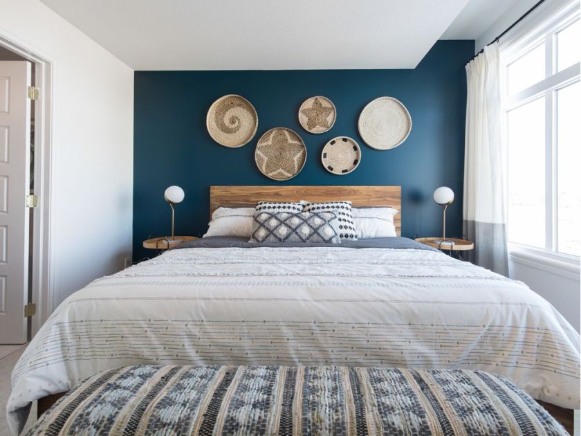
Interior designer Rochelle Cote chose Classic Blue to highlight the Hudson duplex show home by Rohit Communities in Savanna.
As the days grow longer, thoughts turn to infusing our homes with new life and colour and what better way to do it, than to toss in hits of classic blue — Pantone’s colour of the year for 2020.
Saturated and rich, this jewel tone spans tonalities of indigo and crisp navy. Restful and restorative, the shade evokes elegance in its simplicity.
“It’s a colour that has huge impact,” says Rochelle Cote, founder and senior designer at Rochelle Cote Interior Design in Calgary.
“It adds a vibrancy, yet it’s not too bright,” she adds.
The Pantone Colour Institute suggests that the colour brings a sense of peace and tranquility to the human spirit, offering refuge — an anchoring foundation, aiding concentration, enhancing clarity and fostering resilience.
“A boundless blue evocative of the cast and infinite evening sky, Classic Blue encourages us to look beyond the obvious to expand our thinking; challenging us to think more deeply, increase our perspective and open the flow of communication,” says Pantone’s executive director Leatrice Eiseman.
Cote, known for her elegant designs and stunning builder show homes — she works with a variety of builders, including Calbridge Homes — her team is currently working on its 11th Calgary Health Trust Home Lottery show home to be unveiled in August of 2020, says that colour is so important in design.
“I don’t think that people realize the impact of their environment or understand the psychology. It can really affect your mood and colour is part of that,” she says.
She recommends using the Classic Blue shade throughout the home. “I always tell clients to put colour into the items that are easily changeable, so that you can adapt and add more colour as you go along,” she says.
For example, in the recently unveiled Hudson duplex show home by Rohit Communities in the northeast Calgary community of Savanna, she introduced pops of Classic Blue into the furnishings to complement the blue cabinets and island in the open concept 1,627-square-foot home. A feature wall clad in white and classic blue sets the perfect backdrop, weaving the dining room and living room spaces together.
“We then added accents of black rattan and gold, picking up the gold in the faucets. We also used blue on the headboard wall in the master bedroom, accented with warm woods. It’s definitely a cosy place to relax in,” she says.
Rohit Communities builds in both Edmonton and Calgary, offering a variety of single-family and multi-family designs with many of their designer-curated and glossy magazine-inspired finishes incorporating shades of Classic Blue.
Classic Blue pairs well with a variety of other colours including camel, which is also a big colour star this year.
“You can really introduce quite a few colours into a home. The camel with the blue works really well because they are complementary colours,” says Cote.
She also likes to pair gold with the blue and scatter in pops of differing blue tones to add movement and dimension. “Olive green as a contrast also works really well. All of the jewel tones are here to stay for a while,” says Cote.
In the 2019 Calbridge Homes’ Calgary Health Trust Home Lottery Show Home she used contemporary finishes, flat-profiled cabinetry and modern light fixtures paired with the warmth of wood and peek-a-boos of Classic Blue in the furnishings, and art collages, along with the tiles in the master en-suite.
Other ways to add the tried and true Classic Blue colour — consider peppering in the hue in toss cushions, a throw, art, a feature wall or even drench the entire powder room for some sparkling drama.
“Adding small amounts of colour in a variety of different areas helps to bring the colour through, and don’t be afraid to use different shades of the blue tone. it’s all about how you collage it together. It’s like creating an art piece,” says Cote.
And for those looking to round out all of the senses, Pantone has collaborated with a number of experts to create a Classic Blue feast for all of the senses from specialty teas to fabrics, scents and audio recordings, with the goal of expanding beyond the visual to bring Classic Blue to life through a multi-sensory experience.
“As we all head into a new era, we wanted to challenge ourselves to find inspiration from new sources that not only evolve our Colour of the Year Platform, but also help our global audiences achieve richer and more rewarding colour experiences,” says Pantone’s vice-president Laurie Pressman. Check out www.pantone.com for inspiration.
