adplus-dvertising
Connect with us

Art

The art of science – Nature.com

Published

 on


They say a picture tells a thousand words, so by that accounting, the visual word count of a Nature Physics paper doubles that of its text. So how best to use that budget?

The German painter Margaret Leiteritz made a name for herself a century ago by turning scientific data into works of art1. As long-time Leiteritz fans, we at Nature Physics are firm believers in the idea that information carries an intrinsic beauty. When we select images for the cover of our issue each month, we always prioritize those featuring real data. And those data that don’t make it to the cover are lovingly curated in our Instagram account (www.instagram.com/nature.physics/). But aesthetics is only a small part of what makes a figure beautiful — and effective.

Reproduced with permission from: far left, ref. 3, Springer Nature Ltd; top left, ref. 4, H. Kamerlingh Onnes, Commun. Phys. Lab. Univ. Leiden. Suppl. 29 (Nov. 1911); top centre, ref. 5, APS; top right, ref. 6, APS; bottom left, CERN, under a Creative Commons license (https://creativecommons.org/licenses/by/3.0/); bottom right, ref. 7, AAS.

The message a paper tells in its figures can be more persuasive than that of its text. And like the written word, scientific images benefit from a certain economy. Great scientific figures are self-contained and self-evident, conveying only the information necessary to support a paper’s claims.

That’s not to say that brevity should give way to misinformation. We are committed to reproducibility in scientific research, and encourage authors to provide all the data necessary to allow others to understand and replicate their findings. But for this we allocate up to ten extended data files that are integrated into the online version of the paper, in addition to a separate document containing supplementary information. This way, specialists can easily access exhaustive imaging data, for example, leaving the authors free to convey clear, uncluttered information in the figures accompanying the main text of the paper.

Effective figures are also coherent. The caption of each figure published in a Nature Physics paper begins with a single unifying title, regardless of how many parts it has. So ideally, each figure should convey a single message. Think of it as a built-in structure: each paper relays the findings of a study in four (or six) chapters, each with its own illustration.

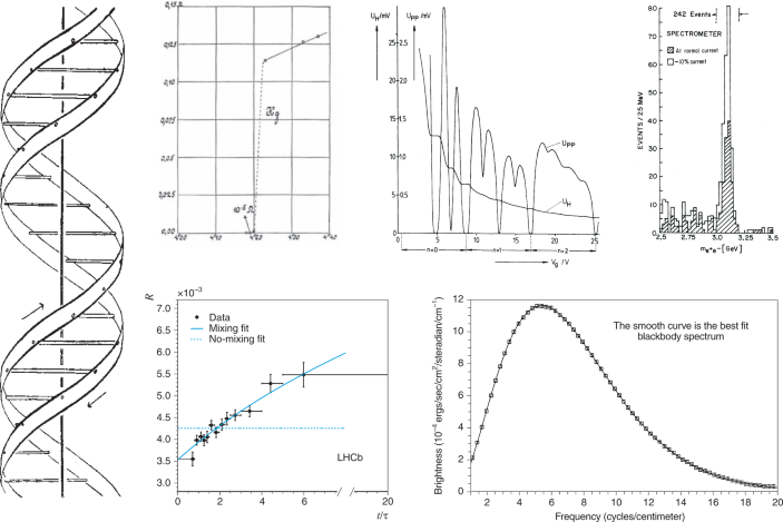
A look back at the history of scientific figures reveals how easily excellent figures capture key findings. For example, James Watson and Francis Crick’s 1953 report of the structure of DNA famously included only a schematic in support of their revolutionary claim (pictured, far left) — perhaps because the data underpinning the discovery weren’t theirs to publish2.

Heike Kamerlingh Onnes offered more information when he presented his discovery of superconducting mercury at the first Solvay conference in 1911 — but the unmistakable jump in resistance (top left) was just as minimal, and as clear, as the double helix. The quantized nature of the Hall voltage of a two-dimensional electron gas was similarly clear in the plot that earned Klaus von Klitzing the 1985 Nobel Prize in Physics (top centre).

The existence of the charm quark was writ large in the signal of what later became known as the J/ψ meson (top right), and the news that neutral charm mesons oscillate — or mix — was similarly effective in a 2013 Large Hadron Collider beauty (LHCb) result (bottom left). Another triumph of data fitting came two decades earlier, when the cosmic microwave background measured on the Cosmic Background Explorer (COBE) satellite was shown to be consistent with the blackbody spectrum, lending crucial support to the Big Bang hypothesis (bottom right).

These plots may not be the masterworks of Margaret Leiteritz, but with a bit of thought and care, figures can be an essential tool for conveying the central conclusions of a scientific paper. And for those discoveries that really do make a difference, in time we can also learn to appreciate them as iconic representations of human enquiry.

References

  1. 1.

    Kemp, M. Nature 430, 508 (2004).

    ADS 
    Article 

    Google Scholar
     

  2. 2.

    Franklin, R. E. & Gosling, R. G. Nature 171, 740–741 (1953).

    ADS 
    Article 

    Google Scholar
     

  3. 3.

    Watson, J. D. & Crick, F. H. C. Nature 171, 737–738 (1953).

    ADS 
    Article 

    Google Scholar
     

  4. 4.

    van Delft, D. & Kes, P. Phys. Today 63, 38 (2010).

    Article 

    Google Scholar
     

  5. 5.

    von Klitzing, K. et al. Phys. Rev. Lett. 45, 494–467 (1980).

    ADS 
    Article 

    Google Scholar
     

  6. 6.

    Aubert, J. J. et al. Phys. Rev. Lett. 33, 1404–1406 (1974).

    ADS 
    Article 

    Google Scholar
     

  7. 7.

    Mather, J. C. et al. Astrophys. J. Lett. 354, L37 (1990).

    ADS 
    Article 

    Google Scholar
     

Download references

Rights and permissions

Reprints and Permissions

About this article

Verify currency and authenticity via CrossMark

Cite this article

The art of science.
Nat. Phys. 17, 869–870 (2021). https://doi.org/10.1038/s41567-021-01332-x

Download citation

Adblock test (Why?)

728x90x4

Source link

Continue Reading

Art

Hannah Gadsby's Picasso exhibit roasted by art critics – The A.V. Club

Published

 on


Hannah Gadsby's Picasso exhibit gets roasted by art critics
Hannah Gadsby
Photo: Maree Williams (Getty Images)

“It’s Pablo-matic: Picasso According to Hannah Gadsby” has been Pablo-matic from the start. The comedian was criticized for launching an exhibit at the Brooklyn Museum, where Elizabeth A. Sackler (of Purdue Pharma infamy) apparently sits on the board of trustees. “Doesn’t matter what cultural institution you work with in America, you’re going to be working with billionaires and there’s not a billionaire on this planet that is not fucked up. It is just morally reprehensible,” Gadsby lamented to Variety, nevertheless moving forward with the exhibit.

After having criticized Picasso in their lauded Netflix special Nanette, Gadsby was tapped to co-curate an exhibition to mark the 50th anniversary of the artist’s death. The show examines Picasso’s “complicated legacy through a critical, contemporary, and feminist lens, even as it acknowledges his work’s transformative power and lasting influence.” The exhibit consists of Picasso’s work with the work of female artists, with the addition of Gadsby’s commentary.

Reviews of the show (which opens on Friday) are, shall we say, not kind. Gadsby’s quips tacked to Picasso’s art “function a bit like bathroom graffiti, or maybe Instagram captions,” writes New York Times reviewer Jason Farago, who dismisses Gadsby’s commentary as “juvenile.” ARTnews’ Alex Greenberger observes that Gadsby’s quotes are “larded with the language of Twitter,” highlighting the label above a minotaur print: “Don’t you hate it when you look like you belong in a Dickens novel but end up in a mosh pit at Burning Man? #MeToo.”

There is no debate about Picasso’s misogyny or any of the more unsavory (and well-documented) aspects of his character. Instead, it’s the apparently facile way Gadsby (with co-curators Catherine Morris and Lisa Small) has chosen to frame the show. The female artists featured do not include female Cubists, women inspired by Picasso, or the female artists Picasso was actually involved with in his life. Instead, their work “[seems] to have been selected more or less at random” writes Farago, while Greenberger notes that many of these pieces from female artists “have almost nothing in common, beside the fact that they are all owned by the Brooklyn Museum.”

The scathing criticism of the exhibit has been met with some schadenfreude online, particularly with the subset of folks for whom Nanette didn’t land. “Still thinking about that perfect @jsf piece on Hannah Gadsby’s Picasso show. Such a sharp evisceration of the corrosive effect a certain strain of meme-y social justice has had on culture and criticism. If people’s receptiveness means we can finally move past that, I’m thrilled,” The New Republic’s Natalie Shure wrote on Twitter. And of course, some people just like a good, well-written take down: “So so so happy that Hannah Gadsby made the Pablo-matic (lmfao) exhibit because the reviews of it have been the best most fun culture writing in a while imo!!!!!,” tweeted writer Sophia Benoit.

Agree or disagree (and perhaps you’ll have to visit the Brooklyn Museum to decide), the criticism of Gadsby’s criticism is lethally sharp. “Not long ago, it would have been embarrassing for adults to admit that they found avant-garde painting too difficult and preferred the comforts of story time. What Gadsby did was give the audience permission—moral permission—to turn their backs on what challenged them, and to ennoble a preference for comfort and kitsch,” Farago writes of Nanette, later adding, “The function of a public museum (or at least it should be) is to present to all of us these women’s full aesthetic achievements; there is also room for story hour, in the children’s wing.” You can read the full piece here.

Adblock test (Why?)

728x90x4

Source link

Continue Reading

Art

Crochet Heart Bomb Project comes together June 3

Published

 on

Handmade hearts will line the chain link fences between the Autumn Grove Seniors Lodge and the hospital in Innisfail, Alta., on Saturday.

It’s called the Crochet Heart Bomb Project.

Local entrepreneur and artist Karen Scarlett started working on the initiative this past January, in partnership with the Innisfail Welcoming and Inclusive Community Committee as well as the Innisfail Art Club.

“Wouldn’t it be nice if a few people joined in on sharing some love and joy with the seniors at the Autumn Grove Lodge and hospital?” Scarlett said was her line of thinking at the time.

300x250x1

The community is welcome to swing by and lend a hand. Also, to help care for the hearts after they’re up.

Turns out she wasn’t alone — others thought it would indeed be nice.

“Our free pattern has been downloaded hundreds of times from locations around the globe and now thousands of hearts are arriving in time for our install party,” said Wilma Watson, Innisfail Art Club president.

A release to media explains the hearts “consist of handcrafted crochet, knit, quilted, macramé and all manner of hand-stitched items,” and “will be installed on June 3 from 10 a.m. to 3 p.m.”

The community is welcome to swing by and lend a hand.

Also, to help care for the hearts after they’re up.

Local entrepreneur and artist Karen Scarlett started working on the initiative this past January.

“I will be leaning on the community to help,” Scarlett said.

“If the community keeps an eye out for damaged hearts and continues to care for the fence and ask for new hearts to be made, we may have a love-filled fence for years — maybe decades — to come.”

She says she’s doing this for Grandma.

Ethel Scarlett was a founding member of the original art club and toward the end of her life, a resident at the original seniors lodge where she was still known for a creative endeavour or two.

“I feel like she would be pretty thrilled with this project,” Karen Scarlett said.

More information is available at innisfailartclub.org/crochet.

A release to media explains the hearts ‘consist of handcrafted crochet, knit, quilted, macramé and all manner of hand-stitched items,’ and ‘will be installed on June 3 from 10 a.m. to 3 p.m.’


728x90x4

Source link

Continue Reading

Art

A new AI trend is 'expanding' classic art and the internet is not happy – Mashable

Published

 on


An AI capability has taken the internet by storm but assuredly not in the manner the creators had hoped. Basically, everyone is laughing at AI’s ability — or lack thereof — to “expand” the background of classic art.

It all started with a few different AI-focused accounts on Twitter posting expanded versions of classic art where, you guessed it, AI filled in the background of famous artwork. What if the Mona Lisa zoomed out a bit and had a much wider field of depth that included a Middle Earth looking castle-ish thing?

This idea hints at the thing that AI Bros — and they are often bros — don’t understand about art. The artists of these classic paintings chose the framing for a reason. It’s called having a point of view. What is included in the piece is important but so is what is not. A work of fine art is more that just oh, pretty, and writing something compelling requires more than regurgitation(opens in a new tab) of plot points.

300x250x1

The internet quickly jumped on the so-called expanded art, turning it into a meme in record time. The basic point of the memes suggested that the whole idea of expanding art in that way is utterly pointless and silly.

It is interesting to see what AI can do. But the folks taking something neat and turning it into an artistic or societal revolution are a bit annoying. I don’t know if AI will one day create truly moving art — if it does, it’ll owe that feat to the art humans already made — but I do know that day is certainly not today.

Adblock test (Why?)

728x90x4

Source link

Continue Reading

Trending