With the 2020-21 NHL season delayed by at least three months, the league needed to do something to stay in the news and create some excitement, or at least maintain some sort of interest.
The “throwbacks with a twist” bring back a jersey from each team’s past, but incorporate a different colour scheme and other changed elements to make each jersey unique. It’s unclear at this point how often each team will wear these jerseys in the coming season — it’s rumoured they will be worn infrequently and likely while their opponents are also wearing their Reverse Retro jersey.
Part of the appeal of these jerseys is that, as one-offs that won’t be worn very often, teams could have fun with the concept and bring back an unusual or particularly nostalgic jersey. Some teams embraced the concept, while others played it safe.
As expected, the Canucks went fairly recent for their “throwback,” making many Millenials feel very old — since when are the early 2000’s retro? — bringing back the gradient third jersey that originally debuted in 2001. The twist is that the jersey uses green instead of maroon, with the gradient giving it a certain shimmer as it transitions to the darker, navy blue at the top.
Overall, the jersey looks pretty good, though the lighter blue outline on the orca logo looks a little out-of-place against the darker blue of the jersey. But where does the Canucks’ Reverse Retro jersey rank against the other 30 teams?
I counted the jerseys down from best to worst, ranking them in tiers. Like Drake, we’re going to start from the bottom.
There’s a lot wrong here. This looks like a straight-up practice jersey — plain white with the only “reverse” element a silver band around the arms and waist instead of red — which is frustrating because the Red Wings have a long history to pull from.
Part of the problem is they have already been involved in four different outdoor games that used retro looks from the past, so it’s understandable that they wouldn’t want to repeat a jersey they’ve done relatively recently. Still, they could’ve gone back to their original illustrated “D” logo from when they were the Detroit Cougars and simply reversed the colours for a nice, primarily-red jersey. That would be different enough.
Alternatively, they could have embraced the concept and brought back the utterly bizarre Cougar logo from their 1928-29 season. Anything would have been better than the decidedly blah design they landed on.
The Leafs have never had a blue leaf on a blue jersey. That’s the twist. That’s it.
Turns out, it’s for a good reason. It looks bad. Given an opportunity to do something fun and different, the Leafs made a bad, bland, and boring jersey.
They had other options. They could’ve made a St. Pats jersey in blue and white. They could’ve switched up the colours on their jersey from the 30’s with multi-striped sleeves. They could’ve made a white verse of the Toronto Arenas jersey from 1918. But they didn’t do any of those things.
This is just the current Islanders jersey in a darker shade of blue. Did they not get the memo? It seems like they procrastinated all summerr and then had to submit something last minute. It’s the “cup of dirt” of hockey jerseys.
Is it a bad jersey? No, because the Islanders have a nice jersey. It’s just the pure laziness and lack of effort and creativity that stings here, particularly when they had the opportunity to bring back the most gonzo jersey in their history: the “Fisherman” logo from the late 90’s, complete with wavy stripes along the bottom and askew name and number on the back.
The fisherman jersey has experienced a resurgence in popularity of late due to nostalgia and a new appreciation for kitsch. This was a perfect chance for the Islanders to bring that logo and jersey back for one more fling, sell a boatload of jerseys, and then once again relegate it to the past.
I understand the idea of taking the old-school Jets jersey and redoing it with modern-day Jets colours, but when that results in a boring, slate-grey jersey, you’ve gone astray. This would’ve been a good opportunity to use the light blue accent colour of their current jerseys as a primary colour.
The Stars late 90’s and early 2000’s jersey with its unique star-shaped striping is a classic jersey design unique to the team. It’s the jersey they were wearing when they hoisted their first Stanley Cup in 1999. It made perfect sense to bring it back for the Reverse Retro series, but they butchered it by making the whole thing white instead of using a different colour for the bottom of the jersey. On top of that, the “Stars” wordmark element of the logo doesn’t stand out enough from the white of the jersey.
I can only imagine how bland these will look on a white ice surface.
Something about the old Blackhawks logo just rubs the wrong way. Placing it on what appears to be a surplus Carolina Hurricanes jersey certainly doesn’t help.
What made the rollout of the Blackhawks Reverse Retro jersey particularly uncomfortable is how the NHL seemed well aware of how controversial this particular logo is. It was the only picture that didn’t show the front of the jersey in the NHL’s announcement and even the Blackhawks initial video only flashed the front of the jersey for a fraction of a second.
I have never been a fan of the diagonal wordmark on an NHL jersey, not even on a “classic” jersey like that of the New York Rangers. At least with the Rangers it has decades of history and tradition: when other teams borrowing the diagonal wordmark design it just looks wrong.
The Colorado Avalanche had a diagonal wordmark jersey and it was bad. The Tampa Bay Lightning and Carolina Hurricanes had diagonal nickname jerseys — “Bolts” and “Canes” — that were even worse.
This Penguins jersey has nostalgia attached to it because it was worn by a number of greats in the 90’s, like Mario Lemieux and Jaromir Jagr, but it’s a bad jersey. Switching the black to white doesn’t improve it and arguably makes it worse.
This should have been easy for the Sabres. The late 90’s and early 2000’s was the only time in their history they strayed from some sort of blue and yellow colour scheme, instead using black and red. Bringing back that buffalo head jersey in blue and yellow would have been a slam dunk.
They went with their third jersey from the same era with the secondary crossed-sabres logo and an odd, unnecessary “Buffalo” word mark in the stripes on the bottom. It doesn’t look bad, necessarily, but it doesn’t look amazing either and it’s such a missed opportunity that it drops them down the rankings.
Bringing back the original logo is the right move, even if I’ve never been a huge fan. The real issue is that switching the main colour to red, in combination with a logo that features so many stars and a prominent hockey stick, makes this look like a Washington Capitals jersey. Whoops.
If the Capitals didn’t exist, this jersey would be much higher on the list, as it’s overall a decent look.
This Flyers jersey is fine, but it was never my favourite design from their history and it doesn’t do anything fun with the Reverse Retro concept. The trouble is that the Flyers have basically had the same jerseys for their entire history, so they don’t really have an unusual retro look to play with.
A fan of the Calgary Flames would probably disagree with my ranking the Flames this low, but I’ve never been a fan of the flaming horse’s head logo, or “Blasty” as it’s known to fans.
I’m doubly disappointed because it’s yet another black jersey in a league that has far too many black jerseys to begin with. Hockey is one of the only sports that is played on a white canvas: let’s paint that canvas with bright, vivid colours!
The Golden Knights were in a tough situation: how do you do a retro jersey when you’ve only been in existence for three seasons? Their solution was pretty ingenious: give a nod to the hockey history in Vegas by bringing back a jersey design from Las Vegas Thunder, who played in the now-defunct International Hockey. League.
Fun fact: Manon Rhéaume played for the Thunder, as did Pavol Demitra, Curtis Joseph, Petr Nedved, and Alexei Yashin.
The jersey itself is fine, with some bold diagonal stripes borrowed from the Thunder, but that’s a lot of red and I’m not sure the secondary logo works as a primary logo. This might have looked better with their primary knight’s helmet logo.
Don’t get me wrong, I like the throwback to the 90’s here, but it’s missing something. Perhaps it’s because the names on the back are in a bland, modern font rather than the retro-futuristic font used in the original jerseys from their first season or the curved namebars they used from 1995 to 2001.
Alternatively, they could have embraced the chaos and brought back their utterly bizarre “storm” third jerseys they wore from 1996 to 1999. This is fine, but a bit safe.
I love that logo and I’m glad to see them bring it back for this Reverse Retro series — see my aforementioned hate for diagonal wordmarks — but this is missing some added pops of colour to make it stand out. A shoulder yoke would no go amiss or some stripes along the bottom or a second colour on the bottom of the sleeves.
This is a nice jersey. I’ve like the Predators’ modern yellow as opposed to the mustard yellow they once used, and it looks good on their original jerseys. And that’s all I have to say about that.
The original Panthers jerseys were among my favourites when I was younger and this update in navy blue looks great. The only flaw is that they’re very similar to the darker Panthers jerseys they wore in the 2000’s. That knocks it down several notches for lack of creativity, but I still love the jerseys.
The Montreal Canadiens’ jerseys have remained essentially unchanged since 1917 and there’s nothing wrong with that. The only issue is that it makes this whole “Reverse Retro” concept a little bit challenging.
In my opinion, they did the best they could, switching up the blue and red, giving them the first primarily blue jersey in team history. The end result looks quite nice.
This is a pretty sharp look, but they get knocked for a lack of originality. It’s not too far from their current jerseys, just with slimmer stripes, and it’s not too different from its inspiration: the classic jerseys the Oilers wore for around 25 years.
Still, the orange shoulder yoke on a white jersey is a new twist we haven’t seen before, so that keeps it from sliding down the rankings any further.
I’m happy to see a yellow jersey from the Bruins, a colour they haven’t worn on a regular home or away sweater since the 60’s. The Bruins get some points for bringing back the insensitively-nicknamed “meth bear,” a secondary logo that made its debut in the late 70’s. They lose points for not making it the primary logo on the jersey for the first time in their history.
I didn’t like these jerseys at first glance, but on closer inspection, they’re pretty clean and crisp. Many Senators fans are happy the team is bringing back the original 2D logo for next season and this Reverse Retro jersey keeps the nostalgia going with a take on the team’s inaugural jerseys with red as the main colour instead of white or black. It’s simple, but it works.
I’m not typically a fan of grey jerseys, but something about this just clicks. Maybe it’s because sharks are grey, so it brings to mind the smooth skin of a great white. Maybe it’s because they retain strong design elements with the curved sleeves, a unique element pulled from their 2000’s era jerseys, and their bold teal colours.
It could just be nostalgia triggered by the original Sharks logo.
The Canucks’ blue-and-green take on their early-2000’s gradient jersey looks good. It’s good. It’ll probably look very nice on the ice. But…
It’s hard to shake the feeling that they could have gone a little wilder with the Reverse Retro concept. A blue-and-green flying-V jersey or a Johnny Canuck jersey really could have bumped the Canucks up a level.
Still, it’s a nice jersey and sneaks into my top-10.
A primarily red jersey for a team named the Blues? Reviving the weirdest jersey design in Blues history, non-trumpet edition? Embracing the whole look, including the weirdly diagonal baseline for the numbers on the back?
The Coyotes’ late-90’s third jersey, with just the head of the classic kachina logo and a surreal desert landscape along the bottom, is arguably their worst jersey. Bringing it back and changing the main colour to purple, a colour previously only seen in the dark of the moon on their shoulder patch? Pure insanity.
Is it a good jersey? Oh lord no. Is it fun and wild? Will it be a hoot to see on the ice? Absolutely.
You may hate this jersey, but you have to respect that the Ducks didn’t shy away from the ugliest jersey in their history. This is what the Islanders should have done with the fisherman jersey: embraced it with sheer confidence and chutzpah, just asking the hockey world to hate it and not caring if they did.
This is exactly what the Reverse Retro series was made for and the only thing keeping it from being higher on the list is that it really is quite ugly. But sometimes ugly works.
All of these jerseys are essentially the same idea: taking the colours and design of a team that isn’t actually them: the Avalanche are not the Quebec Nordiques, the Hurricanes are not the Hartford Whalers, and the Wild are not the Minnesota North Stars.
Still, there’s something wonderfully nostalgic about seeing those old logos and designs, even if it’s somewhat controversial for hockey fans in Quebec City and Hartford who want their teams back.
The Nordiques logo looks surprisingly good in Avalanche maroon and I’m a sucker for the Whalers logo and its brilliant use of negative space. In my books, however, the Wild nail the throwback look the best. They don’t have the rights to the North Stars’ logo, so they instead used the green and yellow on their main logo and it really sings. It’s not a jersey they should wear all the time, but it’s perfect for the Reverse Retro theme.
This is such a great retro look that when you first see it you could swear that the Devils have already worn this exact jersey in the past and they didn’t change anything. But the Devils have never actually worn green as the main colour on a jersey before, even if they used to wear green pants.
There’s nothing fancy happening here, just a great jersey in an uncommon colour and I like it.
The Capitals embraced the Reverse Retro concept, throwing back to the 90’s, the only time in their history they didn’t have the modified “Capitals” wordmark as their main logo. The “screaming eagle” is big and bold, while the diagonal striping screams the 90’s.
The eagle jerseys were a weird light blue, a colour that didn’t connect with their history. Updating that look with a bright red and dark, navy blue really brings this jersey together.
To me, the Kings absolutely nailed the entire Reverse Retro concept. Instead of just taking an old jersey and remaking it in modern colours, they mashed up two classic jerseys to make something fantastic.
The design is the classic 90’s Kings jersey made famous by Wayne Gretzky. The colours are royal purple and gold from the Marcel Dionne era. Together, they look gorgeous. It’s simultaneously vintage and retro, while also fresh and exciting. The NHL needs more bold colours and this jersey really delivers.
What do you think? Did the Canucks nail the Reverse Retro challenge? Which Reverse Retro jersey is your favourite?
The French league’s legal commission has ordered Paris Saint-Germain to pay Kylian Mbappé the 55 million euros ($61 million) in unpaid wages that he claims he’s entitled to, the league said Thursday.
The league confirmed the decision to The Associated Press without more details, a day after the France superstar rejected a mediation offer by the commission in his dispute with his former club.
LOS ANGELES (AP) — Former football star Reggie Bush was at his Encino home Tuesday night when three male suspects attempted to break in, the Los Angeles Times reported Wednesday.
“Everyone is safe,” Bush said in a text message to the newspaper.
The Los Angeles Police Dept. told the Times that a resident of the house reported hearing a window break and broken glass was found outside. Police said nothing was stolen and that three male suspects dressed in black were seen leaving the scene.
Bush starred at Southern California and in the NFL. The former running back was reinstated as the 2005 Heisman Trophy winner this year. He forfeited it in 2010 after USC was hit with sanctions partly related to Bush’s dealings with two aspiring sports marketers.
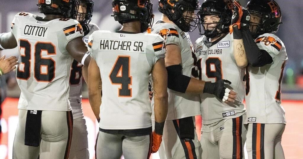
VANCOUVER – A fresh face has been gracing the B.C. Lions‘ highlight reels in recent weeks.
Midway through his second CFL campaign, wide receiver Ayden Eberhardt has contributed touchdowns in two consecutive games.
The 26-year-old wide receiver from Loveland, Colo., was the lone B.C. player to reel in a passing major in his team’s 37-23 victory over the league-leading Montreal Alouettes last Friday. The week before, he notched his first CFL touchdown in the Lions’ win over the Ottawa Redblacks.
“It’s been awesome. It’s been really good,” Eberhardt said of his recent play. “At the end of the day, the biggest stat to me is if we win. But who doesn’t love scoring?”
He’ll look to add to the tally Friday when the Leos (7-6) host the Toronto Argonauts.
Eberhardt signed with B.C. as a free agent in January 2023 and spent much of last season on the practice squad before cementing a role on the roster this year.
The six-foot-two, 195-pound University of Wyoming product has earned more opportunities in his second season, said Lions’ head coach and co-general manager Rick Campbell.
“He’s a super hard worker and very smart. He understands, has high football IQ, as we call it,” Campbell said.
The fact that Eberhardt can play virtually every receiving position helps.
“He could literally go into a game and we could throw him into a spot and he’d know exactly what he’s doing,” the coach said. “That allows him to play fast and earn the quarterback’s trust. And you see him making plays.”
Eberhardt credited his teammates, coaches and the rest of the Lions’ staff with helping him prepare for any situation he might face. They’ve all spent time teaching him the ins and outs of the Canadian game, or go over the playbook and run routes after practice, he said.
“I’ve played every single position on our offence in a game in the last two years, which is kind of crazy. But I love playing football,” he said. “I want to play any position that the team needs me to play.”
While B.C.’s lineup is studded with stars like running back William Stanback — who has a CFL-high 938 rushing yards — and wide receiver Justin McInnis — who leads the league in both receiving yards (1,074) and receiving TDs (seven) — versatility has been a critical part of the team’s back-to-back wins.
“I think we’ve got a lot of talented guys who deserve to get the ball and make big plays when they have the ball in their hands. So it’s really my job to get them the ball as much as possible,” said quarterback Nathan Rourke.
“I think that makes it easy when you can lean on those guys and, really, we’re in a situation where anyone can have a big game. And I think that’s a good place to be.”
Even with a talented lineup, the Lions face a tough test against an eager Argos side.
Toronto lost its second straight game Saturday when it dropped a 41-27 decision to Ottawa.
“We’ll have our hands full,” Rourke said. “We’ll have to adjust on the fly to whatever their game plan is. And no doubt, they’ll be ready to go so we’ll have to be as well.”
The two sides have already met once this season when the Argos handed the Lions a 35-27 loss in Toronto back on June 9.
A win on Friday would vault B.C. to the top of the West Division standings, over the 7-6 Winnipeg Blue Bombers who are on a bye week.
Collecting that victory isn’t assured, though, even with Toronto coming in on a two-game skid, Campbell said.
“They’ve hit a little bit of a rut, but they’re a really good team,” he said. “They’re very athletic. And you can really see (quarterback Chad Kelly’s) got zip on the ball. When you see him in there, he can make all the throws. So we’re expecting their best shot.”
TORONTO ARGONAUTS (6-6) AT B.C. LIONS (7-6)
Friday, B.C. Place
HOME FIELD ADVANTAGE: The Lions boast a 4-1 home record this season, including a 38-12 victory over the Redblacks at Royal Athletic Park in Victoria, B.C., on Aug. 31. The Argos have struggled outside of BMO Field and hold a 1-5 away record. Trips to the West Coast haven’t been easy for Toronto in recent years — since 2003, the club is 4-14 in road games against B.C.
CENTURION: B.C. defensive back Garry Peters is set to appear in his 100th consecutive game. The 32-year-old from Conyers, Ga., is a two-time CFL all-star who has amassed 381 defensive tackles, 19 special teams tackles and 16 interceptions over seven seasons. “Just being on the field with the guys every day, running around, talking trash back and forth, it keeps me young,” Peters said. “It makes me feel good, and my body doesn’t really feel it. I’ve been blessed to be able to play 100 straight.”
This report by The Canadian Press was first published Sept. 12, 2024.