


A huge print of David Bowie’s self-titled album cover. Neon tubing inside the frame of a painting. A tube-shaped sculpture made of suspended rice paper. What do these all have in common?
The fall exhibition lineup for the Vancouver Art Gallery.
On October 17, three new exhibitions opened at the Vancouver Art Gallery: Victor Vasarely, Op Art in Vancouver, and Uncommon Languages. Op Art in Vancouver was developed in conjunction with Victor Vasarely, while Uncommon Languages responds to themes throughout Vasarely’s work, specifically that of a “universal visual language.”
So this review is a buy one get two free. Lucky you!
Victor Vasarely
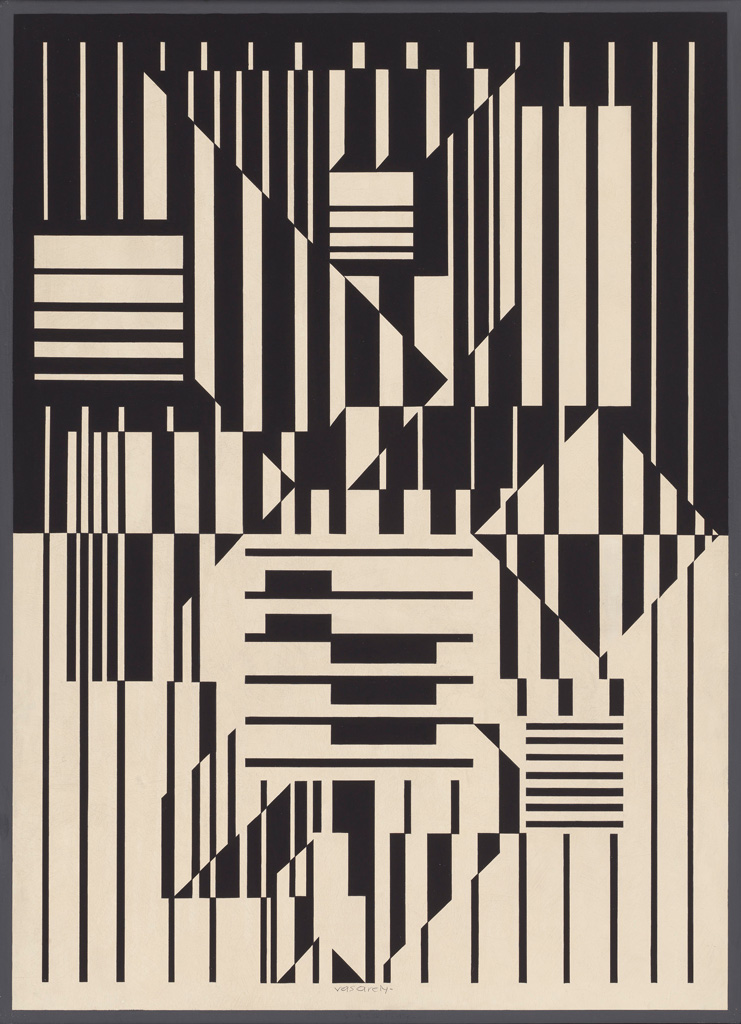
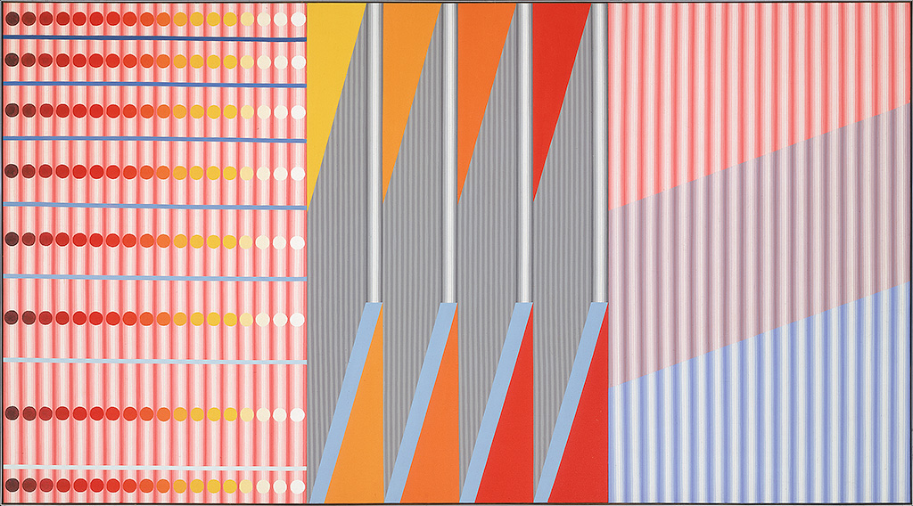
Imagine you’re standing in front of a huge painting. Taller than you, if you were the approximate size of, say, a 5’5” man. The painting is of a grid. Small black diagonal squares — like they’ve been italicized — against a white background.
Except some of the squares are going the wrong way. No matter how long you look at it, your eyes keep going back to those squares, the ones that are pointed in the opposite direction as the rest. There isn’t a pattern of directions reversed. There are just three splotches of nonconformity. But it makes the whole painting jump; you can almost see a weird moving S shape in the grid of squares — except there definitely isn’t one. You’re seeing things.
That’s Vasarely, baby.
Victor Vasarely Planetary Folklore (Orion MC), 1964 screenprint on paper Collection of the Vancouver Art Gallery Gift of J. Ron Longstaffe © Estate of Victor Vasarely/ SOCAN (2020) Ian Lefebvre, Vancouver Art Gallery
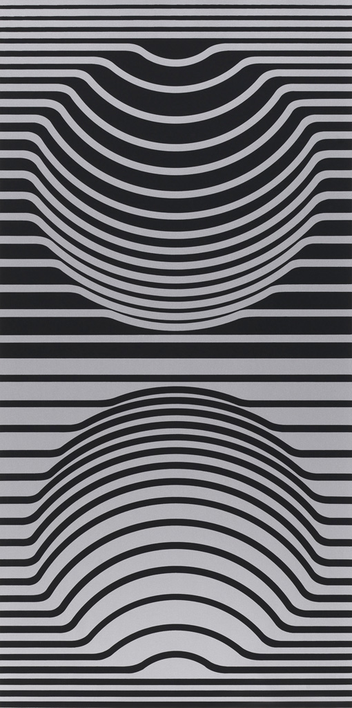
Victor Vasarely was a Hungarian-French artist renowned for his colourful abstract patterns and largely credited as being the father of the Op art movement. Op art, short for optical art, is simply art that plays with optical illusions.
When I think of optical illusions, I jump past pieces that invoke movement or depth in a completely still 2D surface. I tend to look for works which make you squint really hard to see the young woman instead of the old lady. To be fair, those are both optical illusions. But this exhibit, which focuses on Vasarely’s work from the 1960s and ’70s, is much more the former.
It’s simplistic and highly abstract. Shapes and colours.
Victor Vasarely Constellations (Sir Ris), 1967 screenprint on paper Collection of the Vancouver Art Gallery Murrin Estate Funds © Estate of Victor Vasarely/ SOCAN (2020) Ian Lefebvre, Vancouver Art Gallery
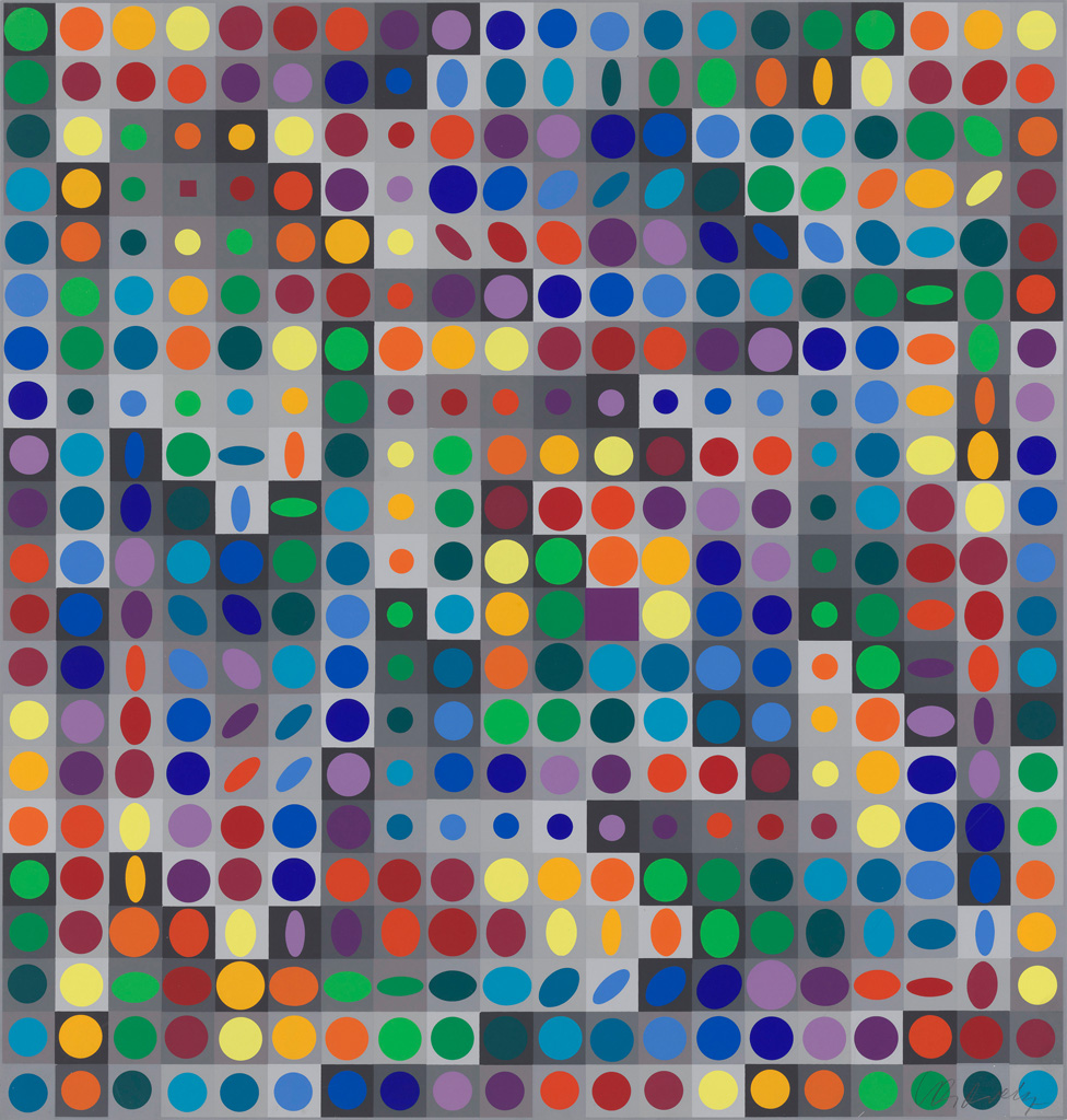
Vasarely worked with such simple shapes and a limited palette for a straightforward reason: he wanted to create a universal visual language. Like, really wanted. Victor Vasarely doesn’t just contain paintings. There are sculptures, books, an album cover, a tea set, screenprints, a mass-produced woven piece and what basically amounts to a board game. (Called Planetary Folklore, it’s basically a build-your-own-Vasarely kit, with patterns matching his actual pieces.)
Despite his impressive breadth of mediums, the pieces I kept returning to were his paintings. I think it’s the scale that gets to me. From far away, they look simple and clean, experiments in design and colour.
Victor Vasarely CALCIS, 1959 oil on wood composite board Collection of the Vancouver Art Gallery Gift of the Estate of Kathleen E. Reif © Estate of Victor Vasarely/ SOCAN (2020) Ian Lefebvre, Vancouver Art Gallery
But if you get close enough, you can still see the brushstrokes; the medium betrays the presence of the artist.
Sorry, Vasarely. There’s no universality. It’s all just you, all the way down.
Op Art in Vancouver
Unsurprisingly, Op Art in Vancouver is about the emergence of Op Art in Vancouver during the late 1950s and early ’60s. This small exhibition is the bridge between Victor Vasarely and Uncommon Language — quite literally because you have to walk through it to get from one exhibit to the other.
While the pieces in Vasarely played with literal optical illusions to convey a sense of movement or depth, the Op-art here is just as concerned with challenging what the viewer expects to see as it is with challenging how the viewer sees.
Which is to say: most of the pieces in Op Art in Vancouver are paintings or screenprints — weird ones. (Neon tubing! Mirrors! Mirrors in the paintings!)
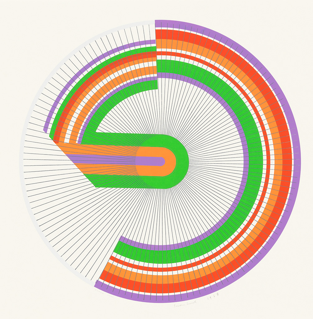
Gordon Smith, Osaka, 1968, screenprint on paper, Collection of the Vancouver Art Gallery, Gift of Gordon and Marion Smith Vancouver Art Gallery
In fact, there’s this fun divide in Op Art in Vancouver between pieces that are noticeably visually jarring and pieces that look essentially identical to contemporary graphic design.
With digital art software, straight lines and solid colours are easy, or at least, easier than they are with paint on canvas. Which is, in itself, something a lot of people don’t think about often, because straight lines and solid colours are meant to look easy.
Why am I so emotional about straight lines? Michael Morris, that’s why.
Michael Morris, Untitled, 1967, acrylic on canvas, Collection of the Vancouver Art Gallery, Gift of Mr. Alfred Blundell, Vancouver Art Gallery
Michael Morris is one of the artists in Op Art in Vancouver. The thing that set Morris’s work apart for me — aside from the mirrors and plexiglass — was the fact that, unlike a lot of his peers, Morris painted without the aid of masking tape and paint rollers, which were used to create the sharp lines and smooth surface that feels so graphic design-y about op art.
The lines in Morris’s work wobble. They’re clearly and visibly imperfect. Yet his design compositions are just as abstract and shape oriented as his counterparts in Op Art in Vancouver. It’s surreal as hell to look at. I highly recommend looking at it.
Uncommon Language
Uncommon Language is the third exhibition in the Vancouver Art Gallery’s fall lineup and the most visually distinct. Quite simply, it’s not op art. While Op Art in Vancouver explores how Op art traditions emerged locally, Uncommon Languages addresses the thematic undertones of Vasarely’s work, specifically his desire for a universal visual language.
But, once you think about it, the concept of a universal visual language is, in a lot of ways, not all that utopian. In fact, it’s deeply Eurocentric, not to mention colonialist. You idealize the concept of a single universal language when society’s standards of “universal” have always included you.
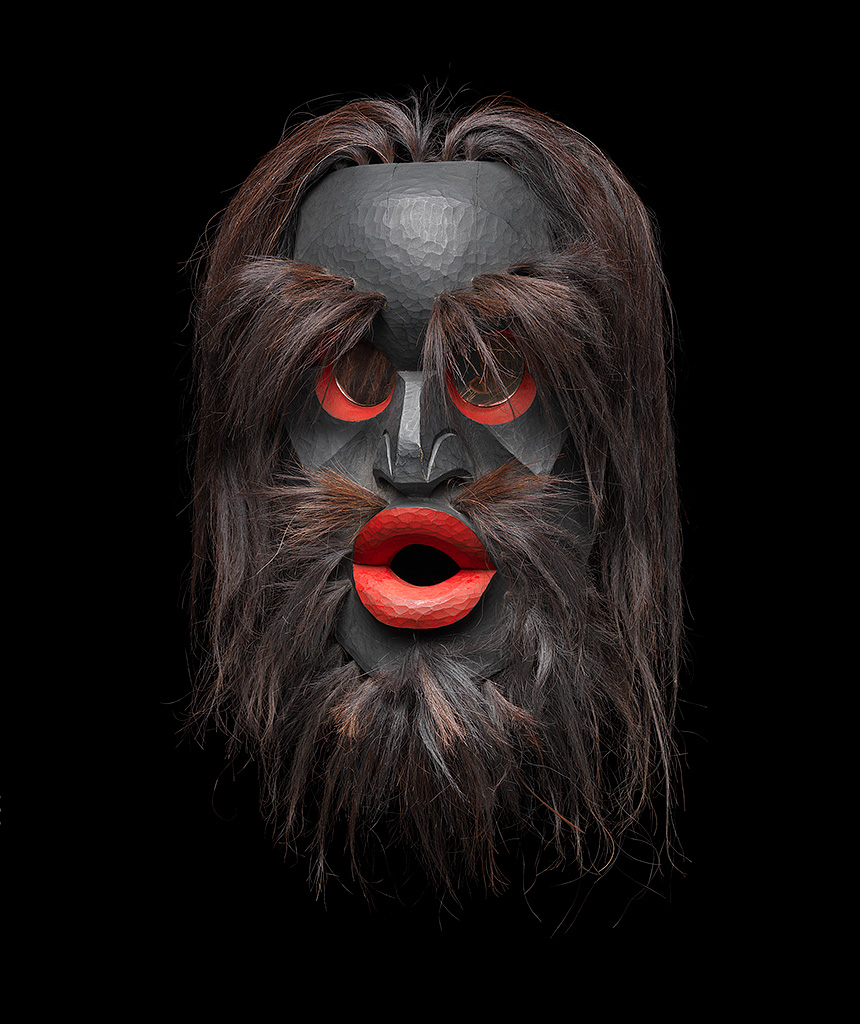
Beau Dick, Dzunukwa Dance Mask, 2002, yellow cedar, hair, mirror, acrylic paint, Collection of the Vancouver Art Gallery, In Memory of Peter and Alice Smith of Kalugwis Trevor Mills, Vancouver Art Gallery
Uncommon Language is a broad and vast exhibition in subject, medium and tone. There’s a marble bench, several poems, a mask, a painting leaned against the wall, a row of books painted black, spliced-together videos of people exercising — it’s a lot.
The pieces here not only expand on a desire for universality and question whose voices are and aren’t being heard, they also challenge the viewer’s expectations of art, similar to op art. It’s just more … conceptual. Like, if we lean a painting against a wall instead of hanging it up, how does that change how we approach the painting?
I agree. That question sounds incredibly conceited when I say it like that. But I also can’t describe how physically uncomfortable it was to see Andrew Dadson’s Black Lean Painting.
Even though Uncommon Language plays with thematic disruption and visual disruption, there is a third, more subtle layer of disruption going on, which is clearest to see in the presentation of Françoise Sullivan’s Dance in the Snow.
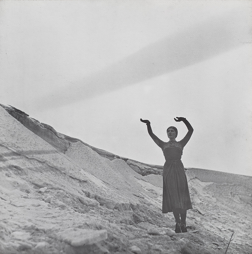
Françoise Sullivan, Danse dans la neige, 1947 (printed 1977), portfolio documenting a dance performance with reproductions of 17 photographs by Maurice Perron and a serigraph by Jean-Paul Riopelle, Collection of the Vancouver Art Gallery, Gift of Max Wyman Ian Lefebvre, Vancouver Art Gallery
Dance in the Snow is a series of photographs of Sullivan performing a dance routine that only three people ever saw. (It was filmed, but the film was lost.) The photographs that comprise Dance in the Snow are presented next to an essay by Sullivan about the dance, published on the 30th anniversary of its single performance.
But the most riveting part of seeing this piece in Uncommon Language is the historical context that the didactic text — the gallery wall text — provides. This is context that Sullivan is deliberately not addressing in her work, or her reflection on her work, like how one of her dance instructors was known for appropriating African dance movements and percussion, or how Sullivan herself positions her reflection on this dance within colonialist tropes of being alone in a landscape.
Uncommon Language pulls a lot of big, theoretical punches. It’s a deeply thought-provoking exhibition.
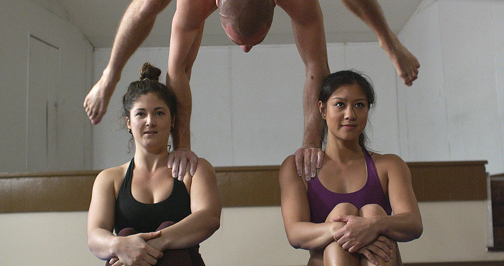
Allison Hrabluik, The Splits, 2015 (still), digital video with sound, 15 min., Collection of the Vancouver Art Gallery, Purchased with proceeds from the Audain Emerging Artists Acquisition Fund Vancouver Art Gallery
But mostly, I wondered why it wasn’t the exhibition literally named after and focused on the works of Victor Vasarely that contextualized his desire for a universal visual language in the historical context of ongoing colonialism. Why it didn’t attempt to contextualize his work in any historical context aside from his fame in the 1960s and ’70s? Why it framed his use of mass production to make artwork more available as revolutionary, instead of, you know, deeply consumerist.
Is it a disservice to present something as simple when it’s actually complex? How much of a disservice, if at all? What might Victor Vasarely and Op Art in Vancouver have gained from talking about their historical contexts within those exhibitions?
I don’t know. But I wonder.
Victor Vasarely, Op Art in Vancouver and Uncommon Language will be open until April 5, 2021.
