<!–
–>

Apple
Multitasking and working with several apps and files at once has become routine on the Mac, but that doesn’t mean there isn’t room for improvement. Since Apple is always working on ways to make Mac navigation more efficient, macOS Ventura introduces Stage Manager, which organizes the open windows on your Mac to help your find the one you need more quickly.
It might not be necessary, but after just a few minutes with Stage Manager, I’m convinced that it will help make Mac usability more efficient. Here’s why.
Mission Control is good, to a point
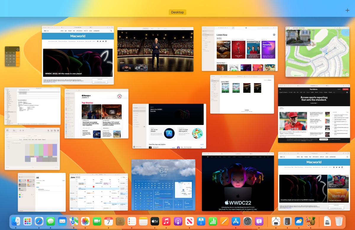
Apple already has an app called Mission Control for window hunting. But it’s not an organizer per se, it’s merely a way to see all your windows at once and find the one you want. That’s fine some of the time, but during serious work sessions, dozens and dozens of windows can be open, turning Mission Control into a macOS version of Where’s Waldo. There’s also Spaces within Mission Control, which creates additional Desktop workspaces, but it’s still not ideal.

Mission Control works fine when it’s easy to spot the window you need. But the more windows that are open, the more difficult it is to find the one you want.
Foundry
Stage Manager is a better manager
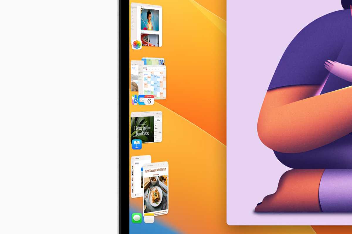
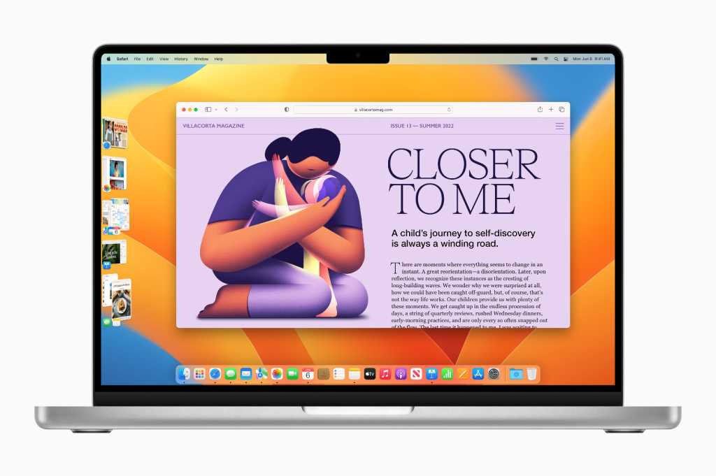
Stage Manager provides organizational elements that Mission Control lacks. Windows are sorted by individual app as thumbnails on the left side of the screen, and clicking on the thumbnail opens the window on the screen. If you have multiple windows of an app open, they appear as stacked thumbnails, and you keep clicking until the window you want appears.
Better yet, you can create groups of windows that go together for your workflow. For example, if you’re writing a research paper, you can have Pages, Safari, Dictionary, and the Notes apps open, and you can group them together by dragging each thumbnail to the center of the screen. When all the appropriate windows are on the screen, just click on one of the thumbnails and Stage Manager automatically creates the group. Then when you click on the group thumbnail, those app windows appear on the screen and any other windows are hidden.
During Apple’s demonstration of Stage Manager, Apple SVP Craig Federighi showed the default setting to “Show Recent Apps,” which places a constant row of thumbnails on the left side of the screen, a visual element that some may consider this added screen clutter.
Stage Manager also has a “Hide Recent Apps” option that you can set in the Stage Manager Control Center module. This option hides the Stage Manager icons, like how the Dock can be set to hide. To make Stage Manager appear, move the pointer to the left edge of the screen. If you’ve set the Dock to appear on the left side, Stage Manager appears underneath the Dock, with thumbnails that are larger enough to access.
This organization is a vast improvement over Mission Control because there’s no more wasted time and energy hunting for a window. Mission Control isn’t obsolete—it’s still handy when there are a small number of windows open. But Stage Manager is better when you’re working on big projects, or you’re not the type who’s conscious about window management.

Stage Manager in action.
Apple
Quirks and limitations
When Stage Manager is on, anything that’s on the Desktop is hidden, but you can still get to your files by clicking anywhere on the screen. The open app moves to the Stage Manager thumbnail row, the Finder takes over, and anything that was on the Desktop reappears.
However, there’s a quirkiness that happens when you have no apps open and Stage Manager is on: there’s still nothing visible on the Desktop. To see your Desktop items, you have to click on the Desktop. (Clicking a second time hides the icons on your Desktop again.) Opening a Desktop item (a storage device icon, a file, etc.) opens it in the center of the screen and hides the other Desktop items.
To avoid this, you can turn Stage Manager off. You may also decide to turn it off when you’re using only a couple of apps at one time. But that means developing a new habit of turning Stage Manager on and off when appropriate, and some might find that too disruptive.
Some of the limitations of Stage Manager include:
- It displays a maximum of five thumbnails, determined by the most recently used.
- The thumbnails can’t be rearranged or resized.
- No options are available if you right-click a thumbnail. This could be handy if, for example, Safari has multiple windows open, and you want to close the top one.
- Apps cannot be quit via a Stage Manager thumbnail.
These limitations, though, are more a matter of convenience than hindrances that prevent Stage Manager from being useful.

Windows can be grouped together so you can create a set that you’re working on.
Apple
You don’t need to use Stage Manager but you probably will
Stage Manager is an option in Control Center, so if you don’t like it or don’t feel like using it, you can quickly turn it off. No one is forced to use it, so if you don’t want to change the way you do things, you don’t have to. You should definitely try it out though. And since it’s a beta, it could get even more useful with some tweaks and changes.
I already like Stage Manager and though I need to adjust to how the Desktop is handled, I can tell that it’s going to save me from a lot of aggravation while using my Mac.
Note: When you purchase something after clicking links in our articles, we may earn a small commission. Read our affiliate link policy for more details.


