Most music lovers seek to go beyond their favourite band’s greatest hits – as that’s often where the hidden gems are found. The same can be said for art from the Middle Ages.
Adam S. Cohen, an associate professor in the University of Toronto’s department of art history in the Faculty of Arts & Science, joined professors Jill Caskey of the department of visual studies at U of T Mississauga and Linda Safran of the Pontifical Institute of Mediaeval Studies, to create the textbook Art and Architecture of the Middle Ages: Exploring a Connected World.
The book, released last month, shows students a broad diversity of places and peoples in the medieval world, as well as a greater variety of works – moving well beyond the usual cathedrals and castles.
Cohen says the idea for the textbook stemmed from a frustration with existing resources, which tended to present the art and architecture of the Middle Ages through a very traditional lens.
“We thought what was needed was to make this already exciting subject even more compelling to students today,” he says.
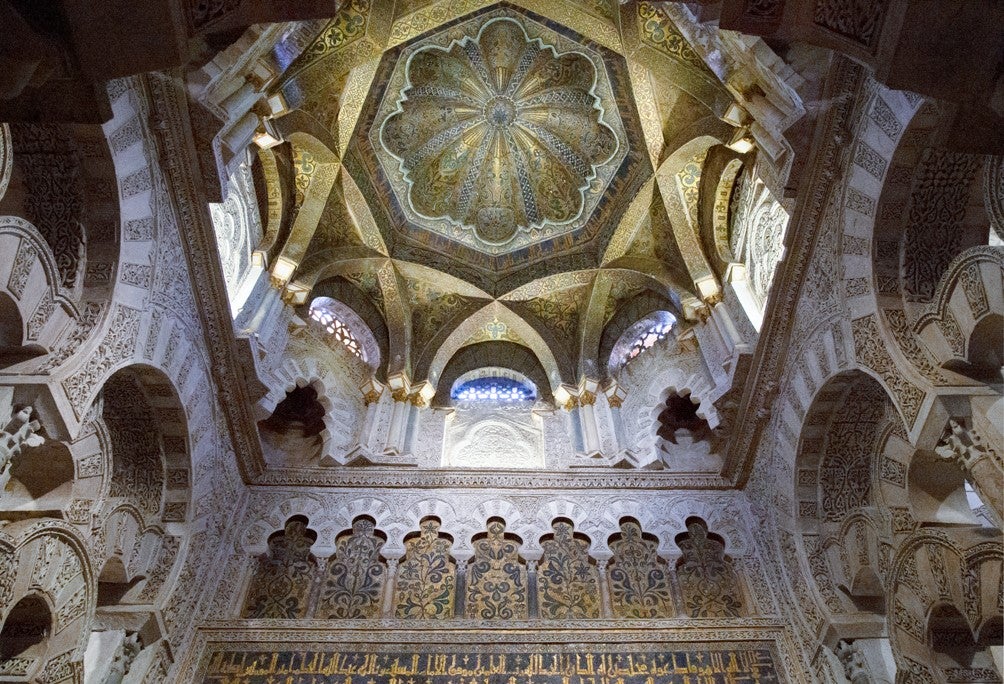
Antemihrab dome, Great Mosque, Córdoba, Spain ca. 961–76.
Spanning over 12 centuries of artistic creation from about 300 to 1400 CE, and covering Europe, western Asia and North Africa, the textbook includes more than 450 colour illustrations of sculptures, pottery, manuscripts, textiles, paintings and buildings. The artifacts are of both a religious and secular nature, covering several faiths, including Zoroastrian, Jewish, Christian and Islamic traditions.
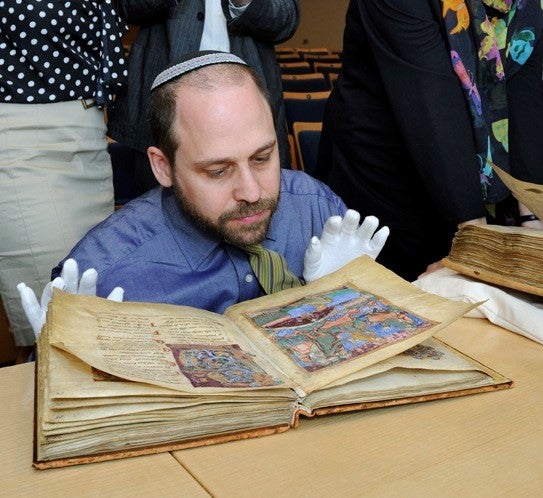
“For myself, I thought I should be teaching Islamic art within the presentation of medieval art,” says Cohen. “So I wanted a textbook that I could use for my own classes that would be more global, more inclusive.”
Cohen, Caskey and Safran worked on the 400-page book for six years. It involved countless hours of research, collecting images, photographing artifacts, as well as commissioning architectural drawings and maps (made by U of T graduate students).
The result is a wide spectrum of objects and art that paints a more realistic picture of people’s daily lives and activities.
“Textbooks in any field tend to reproduce the traditional roster of great monuments and they get trotted out year after year,” says Cohen. “We wanted to respect that tradition in our discipline so that many of the greatest hits would still be there. But we also wanted to shake it up a little and put in new things – things people didn’t traditionally look at that reflect the experience and the built environment of people in the Middle Ages.
“Depending on where you lived, you only saw great cathedrals once or twice in your life. That’s not what most people experienced. So we wanted to broaden the field and show more of what was out there at the time – more everyday things.”
In addition to the images, the book’s introduction provides helpful context to better understand the artifacts’ relevance and meaning.
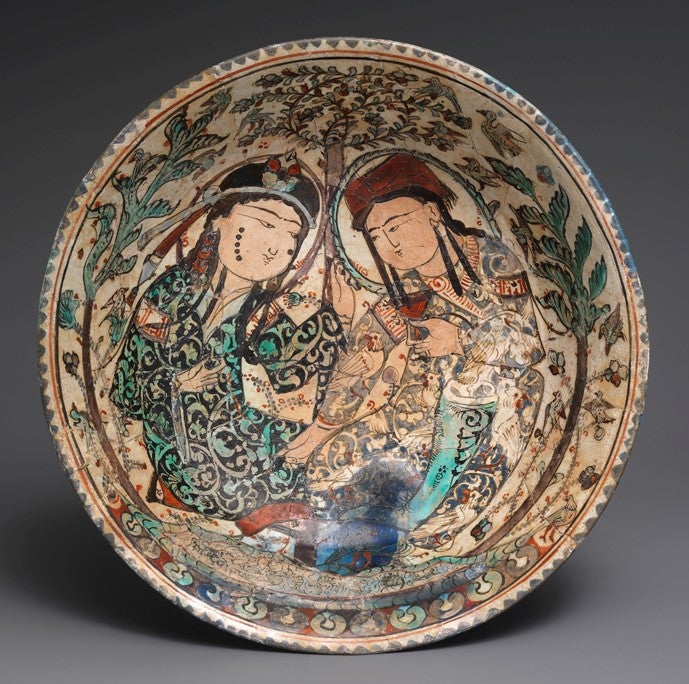
“We tried to lay out some concepts about the different approaches we use in looking at any object in the history of art,” says Cohen. “What’s represented? What’s the style? Who was responsible for the thing looking the way it did? How was it received? [Who] was the audience? If it’s on the altar in a French church, that’s one audience, if it’s a bath house in Jordan, that’s a very different audience.”
As well, each chapter offers a more detailed description of two artifacts.
“For example, we look at a 13th-century French church and say, ‘This is what some of the images represent. This is what the patron was trying to get at in rebuilding his church. These are some of the stylistic changes that were introduced at this particular church that would go on to have great currency in medieval France. Here’s some of the experiences that pilgrims would have had when they came to that church.’
“We hope that doing this twice per chapter will remind people that every object could be treated at this depth, because each object has so many layers.”
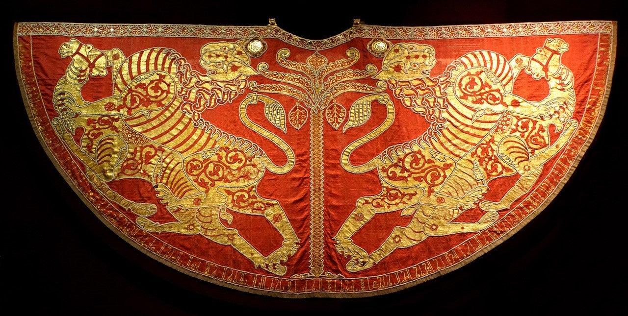
Mantle of Roger II: The precious mantle embroidered with gold, pearls and cloisonné-enamelled plaques was part of the coronation set of robes used at the coronations of the kings and emperors of the Holy Roman Empire. Kaiserliche Schatzkammer, Vienna.
To complement the book, Cohen and his co-authors also created a dynamic website that extends the book’s materials even further. It includes resources such as a glossary, maps, timelines, photo essays, and a podcast “Medieval Art Matters,” where medieval art and architecture experts share their insights and expertise.
“The website is a way to amplify what we show,” says Cohen. “We know that students still like a traditional textbook, but books have limitations – you can only have so many pages and so many pictures.
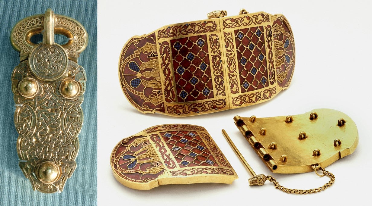
Belt buckle and shoulder clasps, Sutton Hoo, early seventh century. British Museum, London.
“And we could start doing additional things like text translations, things that couldn’t be captured in a book effectively. It’s an opportunity to go bigger in different directions.”
Cohen says he can’t wait to use this book in his classes when he returns from sabbatical in 2024. But his co-editors will be cracking it open with their classes this month.
“Now we feel like we’ve got a textbook that introduces students to the material in a responsible way that reflects our concerns in the 21st century, not the concerns that were shaped in the 1950s and ‘60s.”


