I’m a cover screen convert.
Our first flip-style phones with big cover screens have arrived in the US (pipe down, everyone in China and Europe who has options). The Motorola Razr Plus was the phone that converted me to a cover screen believer — I found it useful not just for checking quick info but also running a handful of full apps I use for simple tasks.
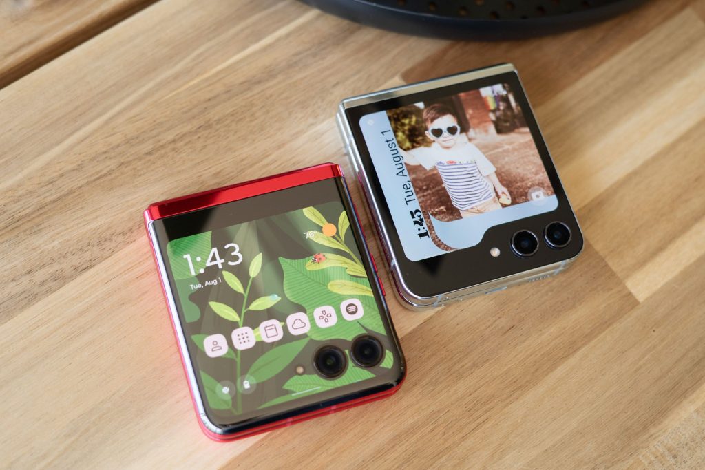
So I’ve been especially eager to check out Samsung’s take on a big cover screen on the Z Flip 5. I’m still putting the phone through its paces, but even after a few days with the Flip 5, I’m ready to declare it the cover screen winner — except when it comes to running full-on apps.
From a hardware perspective, the Razr Plus’ screen is nicer. It’s a smooth 144Hz panel with 413ppi, while the Flip 5’s is a standard 60Hz screen with 306ppi — a resolution difference I can see plainly looking at the two side by side. But speaking purely about the software experience, Samsung is way ahead.
There’s a true always-on display, for starters. There are also a lot more ways to customize your cover screen wallpaper. You can use a photo and customize its filter and frame. Choose whether to display your battery percentage and app icon notifications or live a more peaceful life without this information. Motorola’s options are far fewer: pick your wallpaper and whether or not you want shortcuts to your widget panels, and that’s it.
:format(webp)/cdn.vox-cdn.com/uploads/chorus_asset/file/24824243/Screenshot_20230801_134925_Wallpaper_and_style.jpg)
:format(webp)/cdn.vox-cdn.com/uploads/chorus_asset/file/24824250/Screenshot_20230801_135022.png)
Widgets are also much more functional on the Z Flip 5. Both devices populate the “panels” of the cover screen with widgets that you can swipe between, but Motorola deploys them in a much more traditional sense: they give you specific information at a glance. Samsung’s “widgets” are basically little apps. For example: Motorola’s calendar widget can display a daily schedule view with a few event details or full month — nothing in between. Samsung’s default view gives you a calendar and your daily schedule, and you can tap events to see full details.
Samsung has a real head start here — it’s certainly upcycling some of the ideas found on its smartwatches — and it shows. But despite its disappointing widgets, I much prefer the way the Razr Plus handles running full apps. There’s a menu in the external display settings where you can allow any app on your phone to run on the cover screen, and you can choose whether you want them to transition to the outer screen when you close the phone while running them. Nice and easy! It’s a different story on the Flip 5.
Samsung buries the option to run apps on the cover screen in the Labs section of its settings menu, and once it’s enabled, there are just a handful of apps you can choose from (basically Google Maps and some messaging apps). For anything else, you need to download Good Lock from the Galaxy app store and an additional module called MultiStar. This creates another app launcher panel on the cover screen in addition to the one you already set up with Google Maps and Messages.
Apps are also easier to use on the Razr Plus. The keyboard that pops up has a persistent input field, so you can always see what you’re typing; Samsung’s doesn’t. As a result, you can sometimes lose the input field in an app like Google Translate, where it will disappear behind the keyboard and other UI elements. Kinda takes the wind out of your sails when you’re trying to impress your friends with a quick translation, but it also exemplifies why Samsung really tries to hide this functionality.
As much as I love pushing these cover screens to their limits as a flip phone sicko, it’s fair to say that most people who buy a Flip 5 or Razr Plus aren’t looking to run a bunch of apps on the front panel. Hence, it makes sense why Samsung would put the option out of reach for most users — and why the cover screen keyboard isn’t built with most apps in mind. Here’s hoping that these two companies will borrow some ideas from each other and push for better cover screen experiences in the next generation of flip phones for all of us — sickos or not.
Photography by Allison Johnson / The Verge


