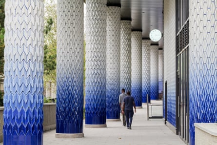
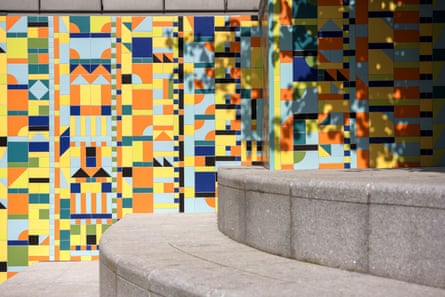
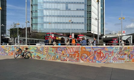
“They last for ever,” says Adam Nathaniel Furman. “When we’re all dead, when the world has ended, they’ll still be here.” The things in question are ceramics and mosaics, favourite materials of the 40-year-old designer and artist. In which case, they – Furman’s preferred pronouns are they/them – will leave behind some arresting remnants for alien archaeologists: a colonnade of sculpted blue-and-white tiles bonded to concrete pillars in the south London suburb of Croydon; a 57 metre-long (187ft) mosaic outside London Bridge station; a multicoloured “quilt” of off-the-peg tiles in a pedestrian underpass in Bristol.

Furman, although trained at the Architectural Association School of Architecture in London, has not completed all the necessary professional qualifications to be technically considered an architect. They create work that runs a gamut of media: chairs, vases, T-shirts and illustrations of architectural icons; installations in Bristol and Croydon. Their Glowbules – a pillar of glowing, handblown glass pebbles – appeared in the Barbie house in Greta Gerwig’s movie. Furman was also prolific on Twitter in the pre-Elon Musk era, using the medium to celebrate underappreciated buildings and promote visions of colourful alternatives to contemporary architecture. Last year, with the architectural historian Joshua Mardell, they produced Queer Spaces, an “atlas” of the clubs, homes, parks, theatres and other places essential to LGBTQIA+ communities.
Furman is driven by a love and knowledge of architecture. “I was a fat, gay kid who got bullied, so buildings were my friends,” they say. They have a particular attraction to ancient Roman and Italian Renaissance architecture, amplified by a 2014-15 residency at the British School at Rome. Theirs is not a po-faced version of antiquity, but one that embraces its excess and dazzling invention. Nor is the classical their only interest: Furman has a generous view rare in the stylistically sectarian world of architecture, one that includes postmodern skyscrapers once derided as corporate monstrosities, icons of Japanese brutalism and Preston’s concrete bus station. Asked if there’s any architecture they don’t like, they struggle to come up with an answer. “I went to Buckingham Palace and that was objectively hideous,” they at last say. “Everything that Queen Victoria touched just died.”

They have what you might call an outsider’s perspective, an obliviousness to official hierarchies of value that mixes the monumental and the marginal, the grand and the transient. It possibly has something to do with their experiences of being queer, or of what Furman calls the “inbetweenness” of their Japanese-Argentinian-Jewish heritage. In any case, ceramics encapsulate this viewpoint, being a process whereby unvalued substances – types of mud and dust – are made precious. Also into something that looks fragile and vulnerable, but which has the potential for eternity of which Furman speaks.
They like, very obviously, colour and ornament, pushing both beyond boundaries of conventional good taste. Their north London studio is a luminous cave of patterns and objects, its surfaces painted pistachio, mulberry, lemon, cerulean and jade, with louche classical statuettes, models of Concorde and the Starship Enterprise, and fabrics and images of their own creation. “I like the senses to be tickled,” they say. This, though, does not mean that Furman offers unfiltered splurges of stimulation. “There’s a high level of control,” they say, “I love rules.” Their designs play with symmetry and rhythm, abstraction and figuration, and with expectations of scale and decorum.

Furman’s recent installations – in Bristol and Croydon and at London Bridge, plus a 50 metre-long work called Abundance near Paddington station – allow them to engage with the public as never before, and on a large scale. These pieces still have the cleverness that goes into all of Furman’s work, but they are also meant to engage people as simply and directly as possible. The aim is to create a “crafted, well-made permanent background that adds quality to everyone’s everyday life”.
The London Bridge installation, called A Thousand Streams, explicitly inspired by Eduardo Paolozzi’s partly destroyed mosaics at Tottenham Court Road underground station, is being slowly made by teams of volunteers and schoolchildren organised by recent graduates at the London School of Mosaic, which means that Furman designed it to suit various levels of skill. Abundance is a long metallic wall of vertical corrugations, whose garden-like colours constantly shift in relation to each other, as the visitor walks around the piece. Furman calls this effect “interaction without moving parts”.

The most substantial and satisfying of these public works is the Croydon colonnade, at the base of a new tower by the architects HTA, whose patterns, according to Furman, bring together the zigzagged pillars of Durham Cathedral with the motifs of the postwar corporate modernist Richard Seifert, who was busy in the neighbourhood. Here, the tiles are three-dimensional, tactile and palpably weighty, their vitreous glaze having what Furman calls a “luscious depth” of colour and crazing, with the “acceptable variation” of occasional accidents – finger marks, unequal gaps – being allowed to temper the generally immaculate finish. The colours grade from deep to paler blues to white. An alternating rhythm of two patterns – arrows and diamonds – animates the walls and columns of the space.
Through being a not-quite architect, Furman gets to thrive in a space of not-quite architecture, between the rigours of transport infrastructure and property development, where it is considered worth investing, under the heading of “public art”, in craft and delight. It’s worth asking why work such as this has to be such a special case, why everyday buildings can’t have these qualities more often. Furman professes a desire to design a skyscraper, a private house and a train station. Perhaps they should.


