The following is excerpted from The Story of Art by E.H. Gombrich, with a new preface by Leonie Gombrich (©2023, released in the U.S. May 3, 2023). Reproduced by permission of Phaidon. All rights reserved.
Preface to the pocket edition
There are no bad reasons for liking a picture. This is the conviction expressed by my grandfather, E.H. Gombrich, in the opening pages of this book—his best-selling introduction to art, first published in 1950 and enjoyed by millions of readers around the world since. When questioned, as he frequently was, about his own artistic preferences, he generally demurred, insisting that he would not ‘give marks’ to paintings. Tastes change, after all. Perhaps it is because this is not a book about tastes, but the story of the fresh challenges that artists identify and tackle from generation to generation, that it has retained its own freshness for each generation of readers.
E. H. Gombrich. Picture credit: Pino Guidolotti
It mattered greatly to my grandfather that many of his most fervent readers have always been, themselves, artists—artists who felt a kinship, through his interpretation, with the efforts of their forebears. Reading it today, it is undeniable that some of the writer’s language is of its time, as are his assumptions about the world that his original reader would have inhabited. Yet despite these historical realities, his telling of the story of art has, over the decades, proved to have a relevance that resists the passing of time—a relevance rooted in our recognition of the universality and importance of the human urge to create, invent and make anew.
In the case of the book you now hold in your hand, the Story of Art has itself, in a sense, been made anew, although the interior remains unchanged. My family are as indebted as was my grandfather to the new generations at Phaidon Press for rising so well to the challenge of reinvention. The sequence of prefaces included here form an interesting mini-history of the different editions in which Gombrich’s narrative has been made available to the public. This pocket format is the latest in a series of thoroughly satisfying reissues.
When the first pocket edition appeared in 2006, five years after my grandfather’s death, I, like many, regretted the disappearance of the illustrative tailpiece originally included at the end of each chapter, as Gombrich describes in his preface to the first edition. The redesign rendered these images contextless, just as the first design had made them necessary—and for modern readers, they can still be seen in the full-sized sixteenth edition, which remains available.
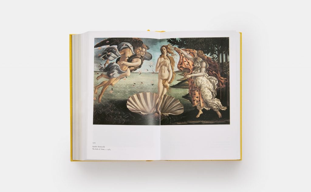
The Story of Art. E.H. Gombrich, with a new preface by Leonie Gombrich, Revised pocket format. Photo: Phaidon.
I was also doubtful of the wisdom, for the pocket edition, of departing from Gombrich’s firmly-held principle of ensuring that images should always appear on the same page as the text in which they are referenced: a principle that caused publisher, designer and author many a tricky conundrum over the years, but which has been greatly appreciated by countless readers. The publisher’s solution was to provide the book with two ribbons, so that the reader can flip effortlessly between text and image. So concerned was I about the deviation from my grandfather’s principle that I felt I must test the arrangement thoroughly. So, I read the re-designed book, and I am very happy to attest that the two-ribbon system works perfectly. Indeed, uncluttered by text as they are in this format, the images gain a clarity that proves to be an unexpected benefit of the pocket edition’s design.
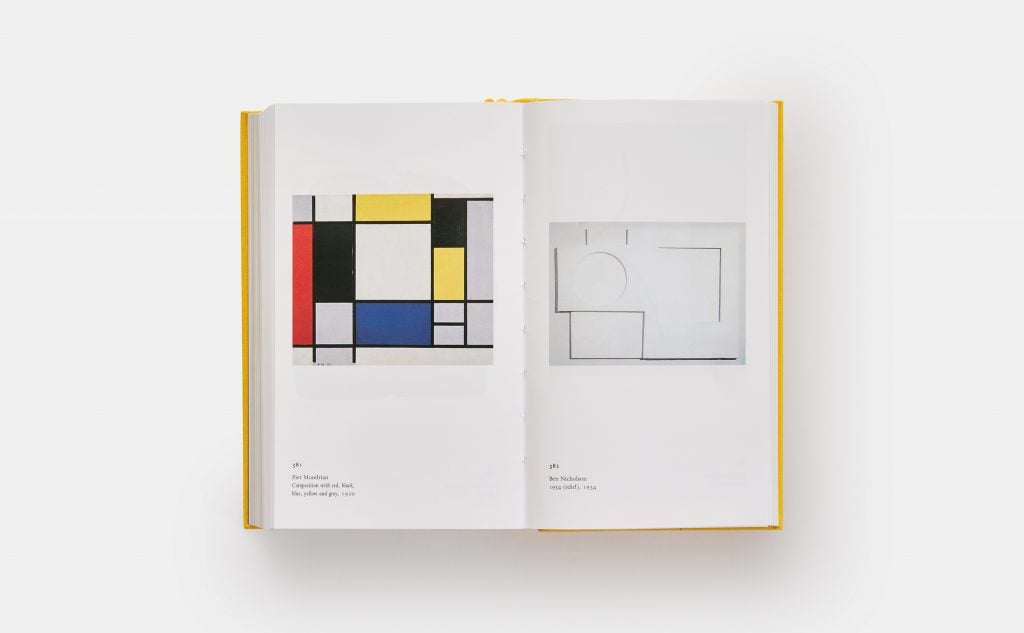
The Story of Art. E.H. Gombrich, with a new preface by Leonie Gombrich, Revised pocket format. Photo: Phaidon.
Best of all, though, was that my test brought me once more into the uninterrupted company of my grandfather. Although I frequently have reason to read other things he wrote, I had not revisited his Story of Art in its entirety for many years. To be honest, I had only meant to re-read a chapter or two—to test those ribbons—but the lucidity, intelligence and sheer humanity of his words drew me on, as they have so many readers past and to come. I remembered what a wonderful companion and guide he was, never more so than when visiting the treasures housed in a museum, gallery, palace or place of worship.
Tastes may change, but for anyone who wants to understand why particular artworks of the past line walls around the world—and why we, today, might care that they do—that tale is here. With this lovely pocket edition, you, too, can take my grandfather with you, and see this world unfold.
Leonie Gombrich, October 2022


