Now go! Make your own cards in THEIR image
1) Custom art & 2) Concept art
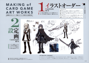
Full art:
TL note: The note at the bottom left is merely translating “creator’s comment” and “illustrator’s comment”, since they are written in English.
Introduction:
“Introduction the process used to created the illustration for the ‘Reinforcement of the Army’ OCG card that comes with this book”
1) Custom Art:
“Using the card’s abilities and effects as the baseline, this is [the step] where the characters that will be appearing in the illustration, their situation and such are established, and the details are conveyed”
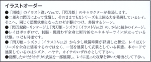
Request for the illustration:
“-The ‘Sky Striker’ characters, appearing in an alternative artwork version of ‘Reinforcement of the Army’”
“-A Raye awakened by two flash blades, showing an even greater power of the X-series. Similarly, an awakened Roze rushes towards there, for a joint battle scene”
“-It should look like a sequel to ‘Sky Striker Mobilize – Linkage!’ and ‘Sky Striker Ace – Shizuku’ (alternative artwork version 2)”
“-Raye should have sustained damage, and have fragmented energy lines running all over her body, both in her uniform and skin. The same goes for Roze”
“-Assume that little time has passed from the fight in ‘Sky Striker Ace – Shizuku’ (alternative artwork version 2). Raye is not equipped with an X-series all over her body, but rather equipped with some parts. Please make [the parts] in the actual card either Shizuku, Hayate or Kaina”
“-Please make the scene so that an awakened Roze is equipped with parts of Kagari, and after heading towards Raye, she deflected an attack”
TL note: The X-series are the various full-armor Link monsters, like X-002 Ace – Shizuku. The “flash blades” can mean pretty much any of the equipment from the theme, but translating them as “Sky Striker” would make it even more confusing.
2) Concept art:
“Using the request as reference, the appearance and clothes of the characters are turned into illustrations. Parts that cannot be included in the card are also designed”
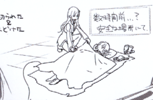
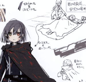
TL note: The title for the following art is “Reinforcement of the Army, version 3”
Setting:
“A few hours earlier…? At a safe location”
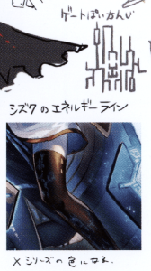
Roze’s notes:
Top: “Cut and untied [hair]”
Middle: “Carried [the blanket] with her and caught up [with Raye]”
Bottom: “It helps her relax when she has it around her neck”
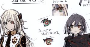
Eyes:
Top: “Shizuku version 2”
Bottom: “Their powers are blending together”
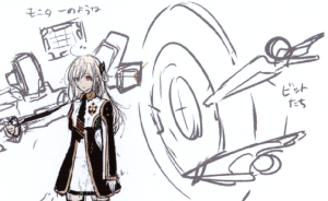
Raye’s design:
Left: “Like a monitor”
Right: “Bits”
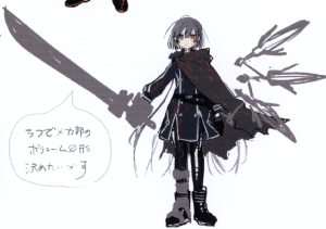
Volume:
“I want to define the volume & shape of the mecha in the [draft/rough]”
Energy lines:
Middle: “Shizuku’s energy lines”
Top: “Gate-like”
Bottom: “They turn into the color of the X-series”
Creator’s comment:
“Since the illustrations for Linkage, Shizuku, and the previous related cards were focused on Raye, for this one I wanted to make a scene where Roze is the main [focus]. After discussing it with the illustrator, I decided that equipping Raye with Hayate would highlight her in contrast with the red from Roze using Kagari”
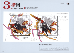
3) Composition:
“The composition is decided so that the illustration can be contained in the frame. There are cases where various patterns are created”
Draft notes:
From left to right: “Back to back”, “Both of them are in mid-air”, “Looks like she’s deflecting [an attack] after having just arrived”
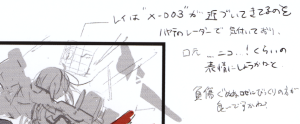
Raye’s expression:
“Raye notices that ‘X-003’ is approaching, using Hayate’s radar.
I was thinking of making her expression in such a way as if her mouth almost looks like…a smile!
Or maybe she is surprised by Roze [showing up], covered in wounds and with a struggling face?”
Illustrator’s comment:
“The direction for the theme and story is checked along with the planner at the time of the conceptualization. I was going to make the details for the weapons more defined after the draft [step], so at this point they were [drawn] very loosely, just to confirm that there are no conflicts with the general feel of the ‘Sky Striker’ series. For the composition, I was told by the planner that since ‘Linkage’ and ‘Shizuku version 2’ had both of them in the ground, this should be a mid-air scene, although I was afraid of the cost of creating a yet unseen scenery for the illustration”
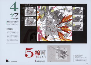
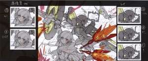
4) [Rough/draft] & 5) Line art
Full art:
4) [Rough/draft]:
“[The illustration continues to be] drawn up to finer details like expressions and effects, in a quality so that the completed illustration can be envisioned”
Expression proposal:
Left: “Roze”, right: “Raye”
TL note: The rest of the notes are exactly what is seen in the expressions, with Roze being either serious or angry, and Raye either smiling, struggling, or being surprised.
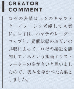
Creator’s comment:
“For Roze, considering the original appearance of the character, I chose her expression to be ‘A’. For Raye, since I liked the illustrator’s proposal that Raye would know about Roze approaching thanks to Hayate’s radar and their mutual resonance due to their awakened state, I chose her expression to be ‘A’, where she is smiling.”
5) Line art:
“The draft is cleaned up, and [the illustration] is completed up to the point right before coloring”
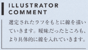
Illustrator’s comment:
“I start drawing the line art based on the chosen draft. I also add lines in order to make the vague parts more defined.”
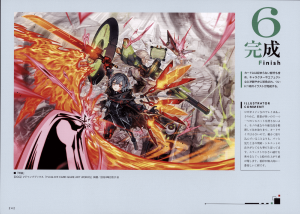
6) Finish:
“The characters, effects, etc. are vividly colored, including even the parts that are not featured in the card, and this 1 illustration is finally complete”
Illustrator’s comment:
“Since Roze is the main [focus], Raye is colored in a simpler way, and because there are lots of elements, I colored them by first ordering the priority of their overlapping, so that their individual silhouettes won’t crash with each other. Because the card size is small, I think it’s more important to focus on the lights/shades and silhouettes that can be easily perceived, rather than coloring in a more detailed way. Adding effects and fragments heavily increases how finished the picture feels. Coloring is my favorite stage of the process”
Thanks to our anonymous contributors for the scans


