adplus-dvertising
Connect with us

Art

‘Ed Ruscha/Now Then’ Review: American Art’s Deadpan Laureate

Published

 on

In the beginning was the word; the image, with all its troubles, came later.

For 65 years now, Ed Ruscha has evaded the presumed exhaustion of painting through a linguistic trapdoor: an equation of language and picture, each putting pressure on the other to produce some of the keenest evaluations any artist has ever made of American life. It was an approach born from advertising and design, channeled into fine art. It looked like Pop, it looked like Conceptualism. It was neither; it was an artistic inquest into the essence of things. What is the essence of things? Might it not be something simpler than they teach in physics laboratories or divinity schools? Might it be, especially in America, something more mundane?

Ed Ruscha / Now Then” opens to the public on Sunday at the Museum of Modern Art, and it is so finely calibrated, so well-balanced — so cool, in stylistic and emotional and HVAC senses — that you may not initially clock its scale. To call it the show of the season is something of an understatement. With more than 200 works, this is the largest retrospective ever mounted of this deadpan laureate of American art, and the most significant New York has seen since the Whitney Museum took a touring show in 1982.

“Pay Nothing Until April,” a painting from 2003. Ruscha’s later text paintings employ a typeface of his own design, which he called Boy Scout Utility Modern.Vincent Tullo for The New York Times
“An Exhibition of Gasoline Powered Engines” (1993). Ruscha’s O’s and S’s are composed solely of straight lines, “like some kind of stiff figure in clumsy clothes,” the artist said.Vincent Tullo for The New York Times

There have been gallery presentations in the interim, and smaller museum showcases, such as the 2005 presentation at the Whitney of his “Course of Empire” cycle, first seen at the American pavilion of the Venice Biennale. But “Now Then” is the first New York museum show since the Reagan administration to engage his full career, and to give his photo books the same attention as his poker-faced paintings. (The show has been organized with the Los Angeles County Museum of Art, to which it will travel in April.) Christophe Cherix, MoMA’s chief curator of drawings and prints, has produced a discreetly historic exhibition — which, I suspect, will have immediate relevance for a generation habituated to the touch-screen, and to its thousand daily digital collisions of text and JPEG, PNG, GIF.

Three paintings of slivers of technical buildings against white, red and blue skies, and a vitrine with contact sheets and photographic books.
Three paintings from the “Course of Empire” series, prepared for the Venice Biennale in 2005, where Ruscha represented the U.S. From left to right, “The Old Tool & Die Building” (2004); “The Old Tech-Chem Building” (2003); “The Old Trade School Building” (2005).Vincent Tullo for The New York Times

It spans the whole top floor of the museum, and it is blessedly stripped of the Los Angeles romanticism that has attended Ruscha in East Coast or European museums. (A 2002 retrospective in Madrid was literally called “Made in Los Angeles.”) It refuses the seductions of the open road. It’s more analytical than I expected, more rhythmic, much less breezy. It thinks hard about English words, American pictures, the lies both can tell. In places, it feels like a walk-in version of Ruscha’s smooth, serial paintings, yet there are also flare-ups of organic instability: notably a whole gallery covered in sheets printed with melted chocolate.

In his pastels on paper from 1975-79, Ruscha used stencils to mask each sheet, then painted the backgrounds with misty fields of color.Vincent Tullo for The New York Times

Edward Ruscha was born in 1935 in Omaha and grew up in Oklahoma City. (It’s rew-SHAY, though everyone struggles with this; while working a paste-up job at Artforum, he grinned and bore the mispronunciations under the pseudonym Eddie Russia.) When he turned 18 he headed west and enrolled in the design program of the Chouinard Art Institute, now known as CalArts. He admired the verve and spontaneity of Abstract Expressionism, but when he tried to paint like Pollock it felt like a parody. The freedom that American gestural painting once embodied had already receded into a brand. His art was going to have to be cooler — not unlike the straight-faced riddles that Jasper Johns was posing in New York at the same time.

“It was an enormous freedom,” Ruscha said later, “to be premeditated about my art.” And during a seven-month sabbatical in Europe in 1961 (documented in this show through charming snapshots), the artist found a number of visual tropes that, when translated into painting, functioned like distantiation techniques. One was commercial signage, with its clarity and high contrast. He began to isolate monosyllables — ACE, BOSS, HONK, OOF — without additional imagery against solid backgrounds.

Conversant of course with Pop, these early word paintings drew just as much on the example of Picasso, Braque and Gris, whose Cubist collages took the frankness of advertising and rendered it strange to itself. The double vowel of “OOF” has the boiled-down geometry of Johns’s targets, an onomatopoeic gut-punch. The blue serifs and black negative space of “ACE” meet in three-dimensional schmears as thick as Barney Greengrass’s.

“Ace,” from 1962.Vincent Tullo for The New York Times
“Boss,” from 1961.Vincent Tullo for The New York Times

A little later, in the 1962 painting “Large Trademark With Eight Spotlights,” he painted the production logo of 20th Century Fox, its letters and numerals appearing to be projected from the picture’s bottom right corner. It’s been cunningly installed here in view of Ruscha’s similarly triangular compositions of gas stations, streamlined and stylized into American oases. The angles culminate in the isometric isolation of “Los Angeles County Museum of Art on Fire” (1965-68), though I’ve always found that one overrated and redundant: the words and gas stations are their own, cooler acts of arson.

A vitrine contains Ed Ruscha’s accordion-folded book “Every Building on the Sunset Strip,” from 1966. Ruscha has spent decades photographing the details of his adopted hometown, which he has published in several artist’s books.Vincent Tullo for The New York Times
“Royal Road Test,” a book the artist made in 1967.Vincent Tullo for The New York Times

The other breakthrough of that early European trip was serial photography. In Cannes in 1961 he’d used his Yashica camera to shoot film posters on the Croisette, and back in the U.S. the next year, he brought that lightweight point-and-shoot on a drive from L.A. back home to Oklahoma. He photographed the service stations along the way from a flat, neutral position, and printed them in a book of his own design. If you’re looking for the romance of Route 66, I suggest you stick with “Easy Rider.” Ruscha’s “Twentysix Gasoline Stations” (1963, and hold the hyphen) boiled down the American landscape from a dream to just evidence, and the book presented a threatening detachment, maybe a bit like industrial documentation or the manuals of the military.

Twenty-six: the whole span of ’em, from A to Z. The gas stations are mundane glyphs in an automotive alphabet, read west to east like an English sentence. (Cherix has trusted visitors to flip through a copy, which dangles from the ceiling on a 12-foot fish wire. Don’t steal it!) Subsequent L.A. photo books — especially the accordion-printed “Every Building on the Sunset Strip” (1966), stretching 25 feet — would double down on the dispassion, recording the city with the same putative impartiality (but in fact deep authorship) that Google Street View would introduce four decades later.

In the later 1960s Ruscha began experimenting with unusual inks and pigment sources, staining his canvases with rose petals, chewing tobacco, his own blood. Bleached gunpowder, he discovered, allowed him to draw more finely and erase more cleanly than graphite; the combustible dust resolved into gossamer ribbons spelling out “Fire,” or “Sin,” or “Quit.” Screenprints with the Old English legends “Mews,” “News” and “Pews” were made with substrates that MoMA’s labels discreetly call “organic”: salmon roe, Hershey’s syrup, and even a Bolognese.

“Chocolate Room,” initially realized at the 1970 Venice Biennale, has been recreated for “Ed Ruscha / Now Then.” Visible through the door is “Spread” (1972); Ruscha applied tobacco stains to both sides.Vincent Tullo for The New York Times

Yet except for the “Chocolate Room” — a rare installation of Ruscha’s, more mouthwatering than mind-altering — the organic materials did not make a show of themselves. And unlike Bruce Nauman, another Midwestern boy made good in California, Ruscha did not dwell in puns and never dipped into irony. His painted and drawn words retained their meaning, but they got thinned and thickened by American commerce: a metaphor he made literal by painting “Annie,” “Adios” or “Rancho” with letters like trompe-l’oeil liquids. The words seem to be formed of maple syrup (slow) or gasoline (fast). The letters appear to run and reform. Do words have fixed senses, or are they empty signs? Neither, exactly; their meanings always slip from their constituent consonants and vowels, drip, puddle, cling to the roof of your mouth.

By the 1970s Ruscha was using pastels to paint longer, more lapidary phrases and sentences: I LIVE OVER IN VALLEY VIEW, or FIND CONTACT LENS AT BOTTOM OF SWIMMING POOL. To be precise, he painted the negatives of these sentences; masking the sheet with stencil letters, he coated the remainder with misty fields of aquamarine and canary yellow. It’s a treat to see them here — Ruscha’s hand-painted backgrounds of the ’60s and ’70s photograph very badly — yet they aren’t dreamy, in the manner of Color Field paintings. Instead they have the commercial consistency of product photography, or, more recently, the soft gradient filters of the latest cameraphones.

“Brother, Sister” (1987), acrylic on canvas. Ruscha adopted a spray gun in the 1980s for darker and more fatalistic pictures without words. Vincent Tullo for The New York Times

Only in the 1980s would Ruscha consent to pick up a spray gun, in large-scale, word-free grisailles of an elephant climbing a hill, or two ships tossed at sea. Yet they didn’t sit easily amid an ’80s-era revival of figurative painting. The ships might as well have been SHIPS, the elephant an ELEPHANT. The backgrounds sometimes had the tears and scratches of a celluloid reel, such as in a large painting of 1991 that stutters “The End.”

In the early 1990s, using the same isometric format and panoramic dimensions he once applied to LACMA’s burning galleries, Ruscha painted a suite of imagined industrial warehouses, again in black and white. Yet in 2005, at the height of the Iraq War, he debuted a rejoinder: paintings of those same buildings, at the same size, but now in color and seemingly in ruin. Together, the ’90s paintings and the new ones became a cycle of American decadence named “Course of Empire,” after Thomas Cole’s five-painting series of the rise and fall of an ancient city-state. But Ruscha’s vision has no middle steps. Dead/alive. On/off. Now/then.

Ruscha painted these three paintings of imagined, low-slung industrial buildings in 1992. In 2005 he revisited the same subjects in color for his series “Course of Empire.”Vincent Tullo for The New York Times

I’m skeptical of Ruscha’s more direct American engagements, which lack the metaphysical ambiguity of his words and phrases, and I have very little patience for recent works like “Our Flag,” a panorama of a frayed Stars and Stripes he painted in Trump Year One. The best of Ruscha’s works this century depict mountain ranges topped with snow, overlaid with new phrases — PAY NOTHING UNTIL APRIL — and gruff obituaries: CLARENCE JONES / 1906-1987 / REALLY KNEW HOW TO SHARPEN KNIVES. Like the Color Field-but-not-really gradients of his youth, these Rocky Mountain backdrops only play at the Romantic sublime. They are as artificial, as mythological, as the gas stations and the gunpowder. This is the manifest destiny that led to the Hollywood backlot.

Back in 1971, Ruscha wrote a text called “The Information Man,” a short parable that, though half a century old, seems directly addressed to young artists lost today in space and screen. “It would be nice,” the story begins, “if sometime a man would come up to me on the street and say ‘Hello, I’m the information man and you have not said the word ‘yours’ for 12 minutes.’” The Information Man informs Ruscha of the locations of all his photo books: “2,026 are in vertical positions in libraries, while 2,715 are under books in stacks…. 7 have been used as swatters to kill small insects such as flies and mosquitoes….”

The opening galleries of “Ed Ruscha / Now Then” include “OOF” (1961) and “Large Trademark with Eight Spotlights” (1962).Vincent Tullo for The New York Times

Like “OOF,” like “Pay Nothing Until April,” the story of the Information Man was as profound as it was mundane, and it suggested how to create something meaningful in a culture grown quicker, lighter, searchable, ephemeral. The Information Man knows photos don’t stay put in books, but are sources of metadata. The Information Man quantifies your utterances, your memories and your dreams, and extracts what value he can. The Information Man — have we all become Information Men? — distills word and image into 0s and 1s, overlaid and transmitted as fast as a meme can fly. But a meme is just more data, blinkered and bastardized; one thing that cannot be information is a work of art.

“The Back of Hollywood,” a panorama from 1977.Vincent Tullo for The New York Times

Ed Ruscha/Now Then
Opens to the public Sept. 10 through Jan. 13, 2024. Museum of Modern Art, 11 West 53rd Street, Manhattan; (212) 708-9400; moma.org.


728x90x4

Source link

Continue Reading

Art

40 Random Bits of Trivia About Artists and the Artsy Art That They Articulate – Cracked.com

Published

 on


[unable to retrieve full-text content]

40 Random Bits of Trivia About Artists and the Artsy Art That They Articulate  Cracked.com

728x90x4

Source link

Continue Reading

Art

John Little, whose paintings showed the raw side of Montreal, dies at 96 – CBC.ca

Published

 on


[unable to retrieve full-text content]

John Little, whose paintings showed the raw side of Montreal, dies at 96  CBC.ca

728x90x4

Source link

Continue Reading

Art

A misspelled memorial to the Brontë sisters gets its dots back at last

Published

 on


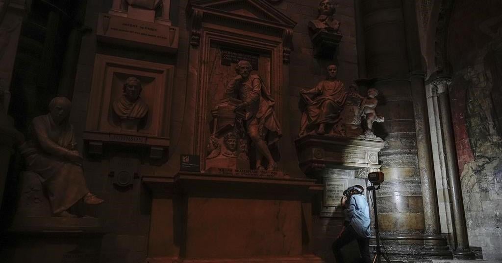
LONDON (AP) — With a few daubs of a paintbrush, the Brontë sisters have got their dots back.

More than eight decades after it was installed, a memorial to the three 19th-century sibling novelists in London’s Westminster Abbey was amended Thursday to restore the diaereses – the two dots over the e in their surname.

The dots — which indicate that the name is pronounced “brontay” rather than “bront” — were omitted when the stone tablet commemorating Charlotte, Emily and Anne was erected in the abbey’s Poets’ Corner in October 1939, just after the outbreak of World War II.

They were restored after Brontë historian Sharon Wright, editor of the Brontë Society Gazette, raised the issue with Dean of Westminster David Hoyle. The abbey asked its stonemason to tap in the dots and its conservator to paint them.

“There’s no paper record for anyone complaining about this or mentioning this, so I just wanted to put it right, really,” Wright said. “These three Yorkshire women deserve their place here, but they also deserve to have their name spelled correctly.”

It’s believed the writers’ Irish father Patrick changed the spelling of his surname from Brunty or Prunty when he went to university in England.

Raised on the wild Yorkshire moors, all three sisters died before they were 40, leaving enduring novels including Charlotte’s “Jane Eyre,” Emily’s “Wuthering Heights” and Anne’s “The Tenant of Wildfell Hall.”

Rebecca Yorke, director of the Brontë Society, welcomed the restoration.

“As the Brontës and their work are loved and respected all over the world, it’s entirely appropriate that their name is spelled correctly on their memorial,” she said.

The Canadian Press. All rights reserved.

Source link

Continue Reading

Trending