adplus-dvertising
Connect with us

Tech

Samsung Galaxy Z Fold 2 review: Waiting on the world to change – Engadget

Published

 on


Samsung wasn’t technically the first company to unveil a foldable phone, but the Galaxy Fold was the first device to demonstrate what foldables could be. And then we reviewers broke them. After that, Samsung seemed to buckle down. It acknowledged its faults, fortified key elements of the Fold’s design, and followed up with the impressive Galaxy Z Flip earlier this year. Now, amid plenty of turmoil, comes the $2,000 Galaxy Z Fold 2 — and it’s at least a little ridiculous.

This is, after all, an extravagantly expensive sequel to a troubled first attempt. Many people can’t buy this phone, and many more almost certainly don’t need to. If nothing else, though, the Fold 2 offers a more polished glimpse of what the future of our phones can be, and what people have to look forward to once these devices become more affordable and mainstream. That’s because it’s the finest foldable I’ve used yet, and Samsung deserves credit for ironing out many of the issues that plagued the original. The thing you need to keep in mind, though, is that while the hardware is miles better than it used to be, the ecosystem around it still has a long way to go.

Engadget Score


Poor


Uninspiring


Good


Excellent

Key

Pros
  • It’s a tablet AND a phone!
  • Both displays are bigger and better
  • Improved design and build quality
  • Solid performance
Cons
  • Extravagantly expensive
  • Multitasking isn’t intuitive
  • Many apps aren’t optimized for tablets/foldables

Summary

With the Galaxy Z Fold 2, Samsung might just have the first great foldable. Its design has been fortified significantly. Both of its screens are bigger and better than before. It uses the fastest smartphone processor you’ll find in an Android phone today. And best of all, the Fold 2 is even more capable than the last one. When it comes to hardware, Samsung did a fantastic job. But the future of devices like isn’t just about hardware. Some of Samsung’s software choices continue to confuse, and getting the most of the Fold 2 requires plenty of time and effort. Beyond that, lingering app compatibility issues mean devices like the Fold 2 still feel inconsistent. Samsung did the hard work of making hardware that’s worth using — now we just need developers to start taking these things seriously.


Be the first to review the Galaxy Z Fold 2?
Your ratings help us make the buyer’s guide better for everyone.


Write a review


Close


Configurations

In the United States, the Z Fold 2 comes in just one configuration, with 12GB of RAM and 256GB of internal storage. What the Fold 2 lacks in flexible storage options, though, it attempts to make up for with flair. The phone is available from AT&T, T-Mobile, or Verizon in the standard black and bronze finishes, but if you order one straight from Samsung, you have the option of customizing the color of your phone’s hinge. Red, blue, gold and silver are all up for grabs — just know that if you plan to pre-order a Fold 2 soon, choosing a custom hinge color may delay the phone’s arrival.

What you get, what you don’t

The first Galaxy Fold was marketed as innovation incarnate, a taste of tomorrow’s tech — if one only available to the well-heeled. This time, Samsung is leaning more heavily into the luxe angle, though not always in the ways you’d expect.

As part of the Fold 2’s “VIP” experience, you’ll get access to service reps trained specifically to deal with the foldable and its quirks. While certainly welcome, this is nothing new — Samsung extended the same courtesy to owners of the original model. What is new is the bevy of flashy perks that come with Fold 2 ownership, including Michelin-starred takeout meals through a service called Tock, a complimentary round of golf, a $50 credit toward in-home hair service (which sounds like a terrible idea to me but whatever), and a year-long membership to FoundersCard, which offers travel and lifestyle benefits to entrepreneurs and now phone nerds.

The message here is clear: You’re not just a Fold 2 owner. You’re an Important Person. It’s a clever way for Samsung to justify the phone’s $2,000 price, but most people probably would have preferred getting more goodies in the box in the first place. While the first Fold came with a carbon fiber case and a pair of Samsung’s AKG-tuned Galaxy Buds, this year’s model comes with… a charger. Oh, and one of those SIM removal tools. The paucity of pack-ins here is a little surprising considering Samsung’s earlier largesse. For what it’s worth, you can request a pair of wired AKG earbuds, though it seems clear Samsung hopes you won’t bother.


Chris Velazco/Engadget

An improved design

Despite Samsung’s best intentions, the first Galaxy Fold left us with plenty of questions about the viability of foldable phones. Even if you put aside the whole “don’t-remove-that-screen-protector” thing, the Fold still had issues. The original hinges had gaps large enough to let schmutz inside. Its big, flexible screen didn’t well terribly well protected. And our second review unit developed a cluster of dead pixels. This year, things are different.

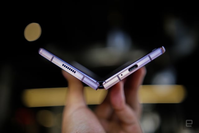
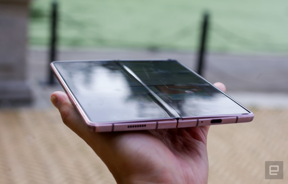
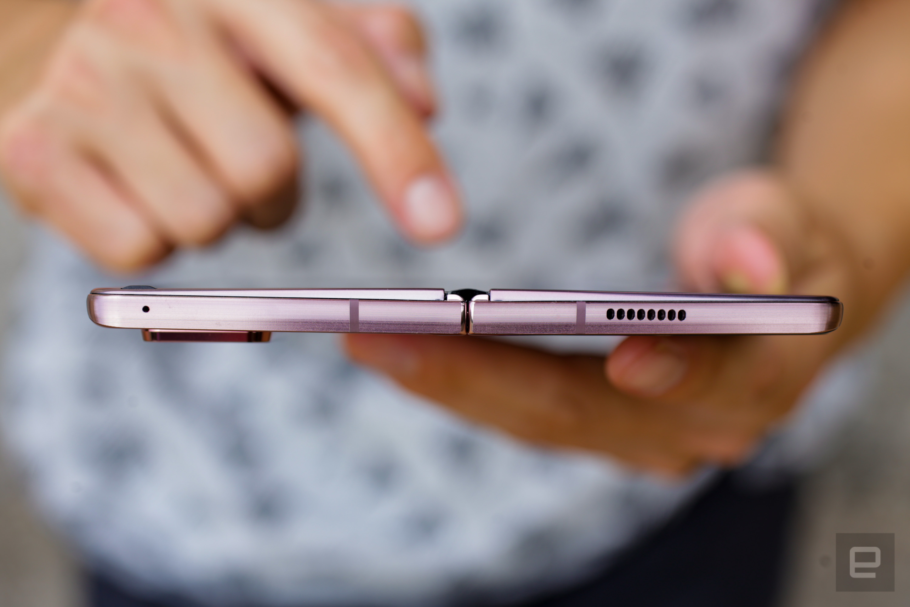
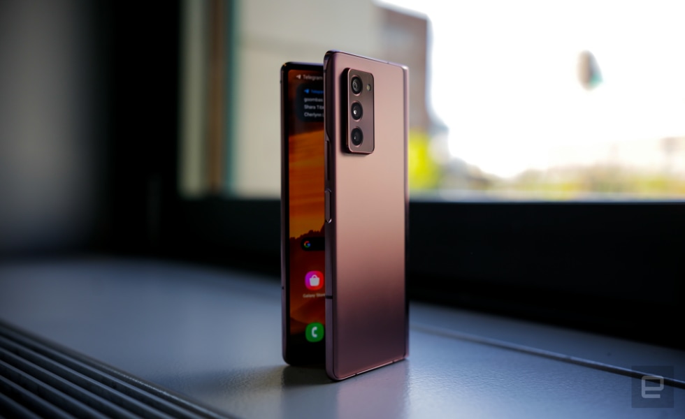
The first Galaxy Fold was chunky any way you looked at it, and this year’s version is technically even chunkier. It’s a little wider and a little heavier than the original, and it still feels like a fat remote control when it’s closed, but the plus side is it should be a lot more durable. The gaps on either side of the hinge are razor-thin, which should keep bits of debris from getting inside. And there are tiny brushes on the inside of the phone’s two halves, so when you open the Fold 2, they scrape along the outside of the hinge to push away out of the danger zone. You can even hear them at work sometimes as you start to unfold the phone.

Samsung Galaxy Z Fold 2 review

Chris Velazco/Engadget

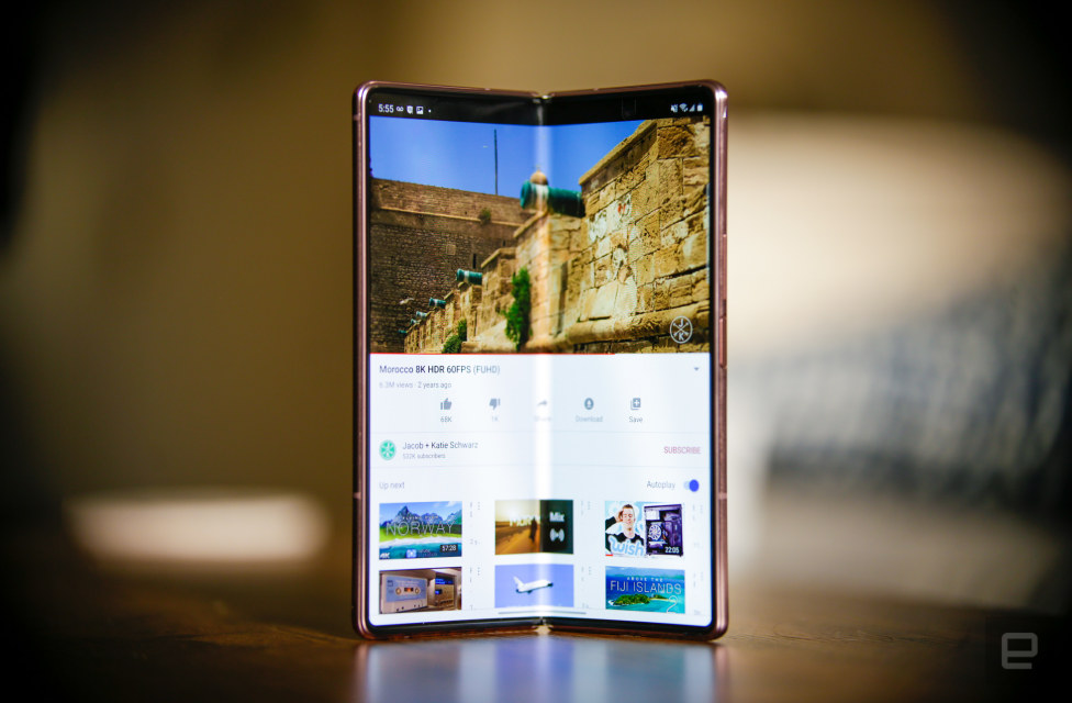
The hinge itself is also much tighter this time around, to the point where you can prop the Fold 2 open like a pseudo-laptop on a table. Samsung calls this Flex Mode, and I know what some of you are wondering: Yes, you can type on it like a laptop, but it’s not very enjoyable, and yes, you can still open the Fold 2 with one hand. It’s just a lot harder this time, which if nothing else means I can’t treat this thing like a fidget toy the way I could with the old one. I wouldn’t recommend trying unless you like the concerning feel of your thumbnail digging into the screen. Once open, you’ll also notice the small gaps at the top and bottom of the display remain capped to prevent stuff from slipping under the thin display layer. 

All of this should help keep the Fold 2 running reliably, but we’ve had our review unit for less than two weeks and can’t make any promises. In fact, you should still handle this thing with kid gloves. Like last time, the Fold 2 doesn’t carry an IP rating for water or dust resistance, so you just can’t be as cavalier with it as you would other phones. And while the internal display has been fortified with a layer of Samsung’s Ultra Thin Glass, I still shudder to think about what it would look like after a faceplant on asphalt. Unfortunately, I can’t offer any lasting reassurances about the Fold 2’s durability, since we’ve had our review unit for less than two weeks. (Don’t worry: we’ll keep you updated as we continue to test this thing.)

Chris Velazco/Engadget

Image credit: Chris Velazco/Engadget

A tale of two screens

The best thing the Z Fold 2 has going for it is its flexibility: It’s a standard, if really tall, smartphone when all you need is to idly flick through Twitter or make a call. When it’s time to put a dent in a novel or scour the next few weeks of your calendar, just open it up and click — you have a small tablet at your disposal. It sounds simple enough, but the reality is a bit different. That old saying about jacks of all trades comes to mind: the Z Fold 2 is good at playing phone and tablet, but it’s not amazing at either role. Sometimes that’s easy to accept; other times, it’s enough to make you wonder about the future of foldables.

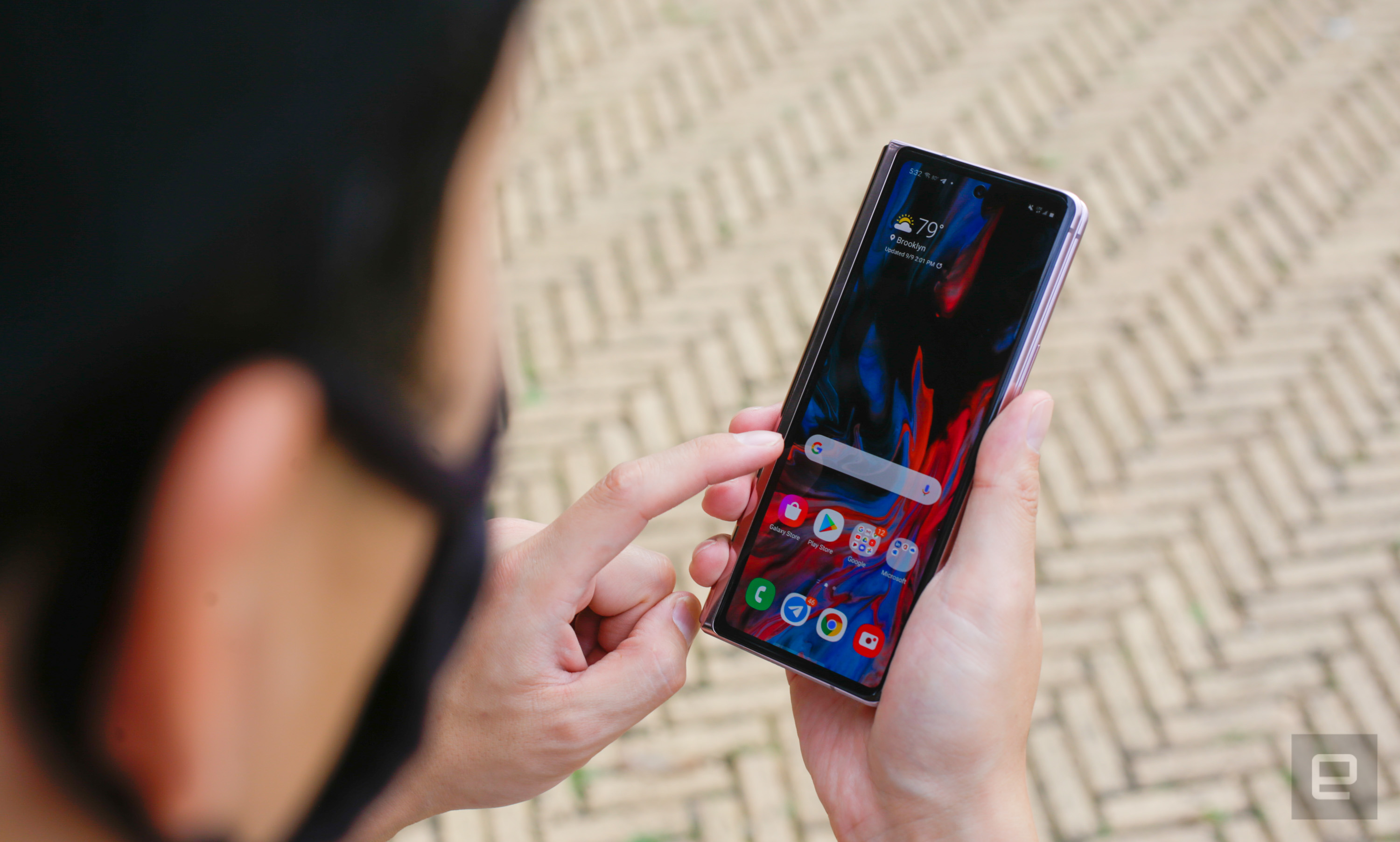
To Samsung’s credit, it fixed just about everything I didn’t like about the first Galaxy Fold’s external display — and there was a lot I didn’t like. That original display was a relatively tiny 4.6-inch Super AMOLED panel that sat wedged between some of the biggest bezels I’d ever seen on a phone, and its narrow aspect ratio made using most apps frustrating at best. With the Z Fold 2, Samsung replaced that hokey screen with a 6.2-inch Dynamic AMOLED display that doesn’t just look great — it’s perfectly usable, too.

Gallery: Samsung Galaxy Z Fold 2 review | 27 Photos

The original Fold’s cover screen was best saved for the most momentary of interactions, but that’s just not the case here. More than anything, I’ve been surprised by how often I don’t open the Fold 2. Granted, the screen is still super narrow and can feel a little weird to use at first, but it lends itself well to scrolling through long passages of text and the occasional YouTube video. It’s even pretty helpful for catching up on my glut of group chats, though its limitations became very clear when it was time to respond to those messages.

Even after a week of practice, my stubby thumbs still struggle to hit the right keys while holding the phone in one hand. The fix is pretty simple, though: Just turn the Fold 2 on its side. Then, the keyboard fills the entirety of the screen, which usually leaves just enough room to see what I’m typing. I should also point out the external and internal displays use completely separate home screens, which leads to some interesting use cases. Personally, I’ve filled that outer screen with widgets to control my apartment’s Hue lights — when closed, the Fold 2 already kind of feels like a remote control, so I leaned into it. 

Oh, and in typical Samsung fashion, this screen looks fantastic too. I could gripe more about the screen’s dimensions or about how it only refreshes at 60Hz, but then I’d just be looking for nits to pick. It’s not ideal for every single task, and a wider screen would’ve helped a lot here — that would make the inner screen look like a widescreen tablet! — but the Fold 2 is a pleasantly functional smartphone even when it’s folded. 

Let’s be honest, though: If you’re reading this review, you’re probably more interested in the other screen. 

Chris Velazco/Engadget

Image credit: Chris Velazco/Engadget

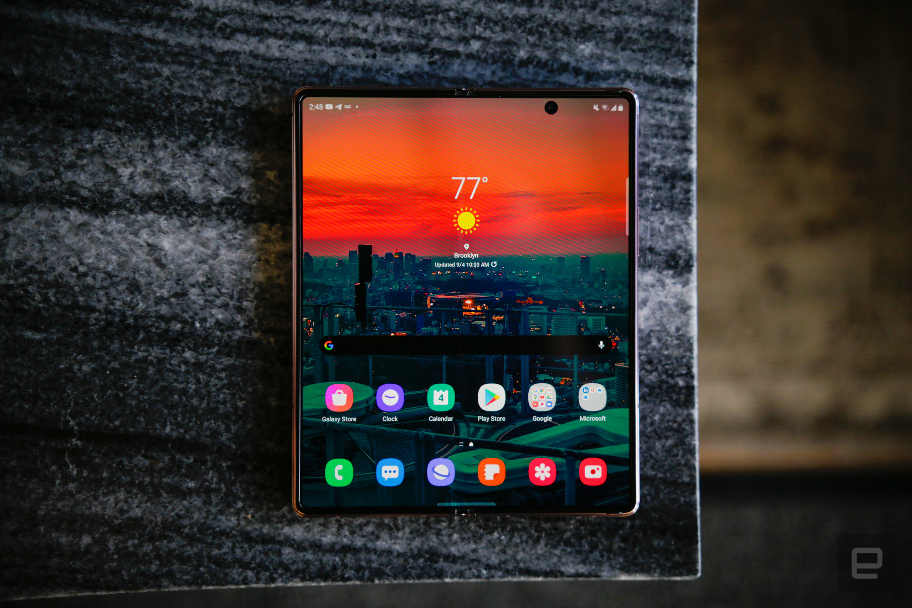
Samsung improved on this internal display in just about every way that matters. Rather than use another awkwardly shaped notch to accommodate a front-facing camera, the company went with a much less obtrusive circular cutout. The bezels around the display have been dialed down, too, so Samsung could squeeze a slightly larger 7.6-inch panel into a body that’s basically the same size as the original. Like the Note 20 Ultra, this screen uses a variable refresh rate: When you’re reading an article or examining a photo, the Fold 2 saves battery life by refreshing the screen as little as ten times per second. And when you’re playing supported games, that refresh rate can ramp up to as much as 120Hz for super-smooth motion and animations. 

To top it all off, this thing is mostly beautiful, with all the deep blacks and vivid colors you’d expect from a Samsung screen. Everything appears plenty crisp thanks to the panel’s 2208×1768 resolution, and HDR10+ certification means movies look mostly excellent here too. (That is, as long as you don’t mind living with some serious letterboxing.)

Now, I say “mostly” beautiful because there are some things about this screen that Samsung couldn’t fix. For one, the jelly scrolling issues we first spotted in the original Fold are back, thanks to how Samsung’s engineers laid out the screen components. In case you haven’t heard of this delicious-sounding flaw before, it describes how one side moves of the display moves slightly faster than the other when scrolling vertically. Here’s the thing, though: Now that Samsung is using a new kind of screen, it’s barely noticeable when the display is set to run at a variable refresh rate. In other words, I don’t consider this a dealbreaker.


Chris Velazco/Engadget

Same goes for the screen’s crease, which you can see and feel as well as last time. Some people find it unacceptable; others don’t seem to mind very much. Both camps have their points, but here’s what happened to me: The first day, I couldn’t stop looking at it. Three days in, I only really noticed it when my thumbs grazed it. After a week, I forget it’s there nearly all the time. It’s just like the notch all over again.

Crease or not, this screen should be more durable than what we got the first time around. Like with the Z Flip before it, Samsung added a layer of its Ultra Thin Glass (UTG) to harden the Fold 2’s screen. This is a big deal for two reasons: First, it means this internal display should hold up more capably to everyday wear and tear. After all, you’re meant to be poking at this thing for years — the thought of doing that to the original Galaxy Fold and its soft inner screen was always sort of uncomfortable, but those concerns have mostly evaporated with the Fold 2. 

The second reason this UTG layer is important is because it should make the Fold 2’s big screen feel more like a regular tablet’s would. When you’re typing or multitasking at full tilt, the last thing you want to worry about is whether you’re being too hard on the screen. With this incredibly slim layer of glass in place, I didn’t worry about poking and prodding the way I did with the first Fold. Just note that I said Samsung’s UTG should feel more like a regular tablet — whether or not it actually does is entirely up to you.


Chris Velazco/Engadget

See, the Fold 2 ships with a gummy plastic screen protector already installed on that main display. It feels like the one the original Fold used, and caused a little extra friction as I swiped around the interface. Now, if this were my own phone and not a temporary loaner, I’d peel this screen protector off immediately. The thing is, Samsung really does not want you to do that. Despite spokespeople saying that the top plastic layer is removable, you’re warned multiple times after cracking open the box to leave it in place. 

Subsequent conversations with Samsung’s PR revealed that, yes, sure, you totally can remove the screen protector… as long as you let a Samsung technician or partner do it for you. Um, what? The company’s mixed advice here is confusing at best, but it seems clear that Samsung is trying to avoid a rehash of the last time people tried to peel the plastic off a Fold’s screen. I get the rationale, but honestly Samsung: Just pick a message and stick to it, will you?

Ultimately, I don’t think this is a huge issue. The best thing to do for the Fold 2 long term is probably to just leave it on, but look — you’ve got options. What’s more important here is how this bigger, foldable screen helps you get stuff done, and after a week of testing, it’s clear Samsung still has some work to do. 

Engadget

Image credit: Engadget

The foldable life

Here’s the big question I’ve been pondering since I got the Fold 2: Does a $2,000 foldable smartphone actually help you do more than a regular one? So far, the answer has been a resounding “sort of.” When everything works, you might never want to go back to the old way of doing things. The problem is that you can’t always count on those features working the way you want them to.

There’s a lot to unpack here, so let’s start with the basics: How the Fold 2 actually displays things. One of the biggest knocks against the original Fold was that, too often, its big screen acted more like a giant smartphone than a small tablet. This time, the Fold 2 offers two different display size settings: One that, like the original, treats the screen like a big phone, and another that packs information more densely onto the screen like a tablet. I’ve spent most of my time in the latter mode, and the results can be truly helpful — emphasis on “can be.”

When you hold the Fold 2 upright, pretty much everything looks the same no matter what display mode you’re using. It’s a different story when you hold it sideways, though: Samsung’s Messages app shows you a proper inbox and a full message thread. Gmail does the same thing. The New York Times app switches to a richer, multi-column view that’s totally inaccessible from “smartphone” mode. YouTube shows off the full description beneath the video, along with upcoming videos on the right side. In short, the Fold 2 tells those apps to treat it like a tablet, and they respond beautifully. But not all of the apps you use regularly might know how to do that, so even when you’re trying to avoid using the Fold 2 as just a large phone, it occasionally happens anyway. 

In fairness, that’s not a deal-breaker: Most of the apps that aren’t optimized for bigger screens still look and work exactly the way they usually do. The problem is when you run into apps that don’t know what to do with the Fold 2 at all.

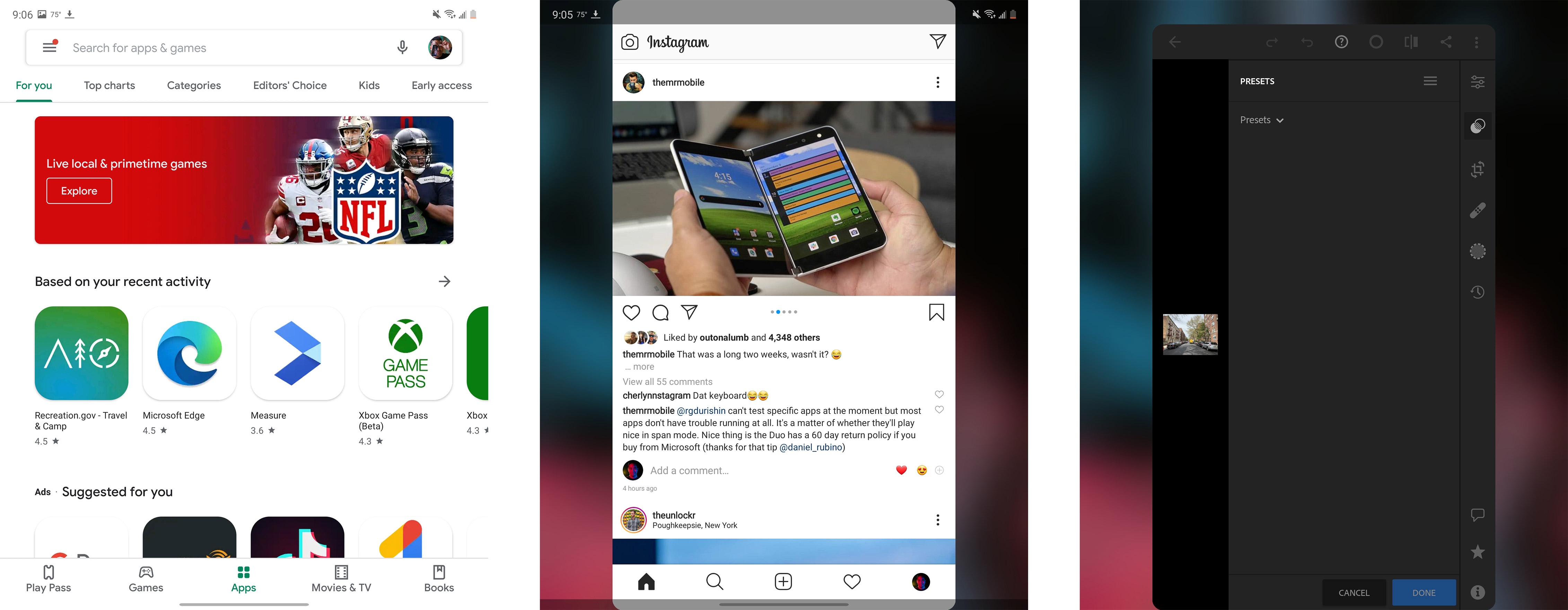
On the Fold 2’s main screen, the Play Store (left) looks like it would on a giant phone. Meanwhile, Instagram and Lightroom (center and right) don’t handle the big screen well.

Engadget

Image credit: Engadget

Some apps, like Lightroom, simply refuse to acknowledge that second, bigger screen. When you launch it, it appears in the center of this display, looking just like it does on a smartphone. (Never mind the fact that Lightroom runs admirably on regular Android tablets.) AccuWeather treats the open Fold 2 screen as a tablet in landscape mode, so using the app requires turning the phone sideways. HBO Max, isn’t available for the Z Fold 2 at all right now. And Instagram — well, Instagram has always been notoriously bad adapting to different kinds of displays, so it’s no surprise it’s still pretty terrible here. The point is, unless you stick to a handful of known-good apps, expect a lot of inconsistency.

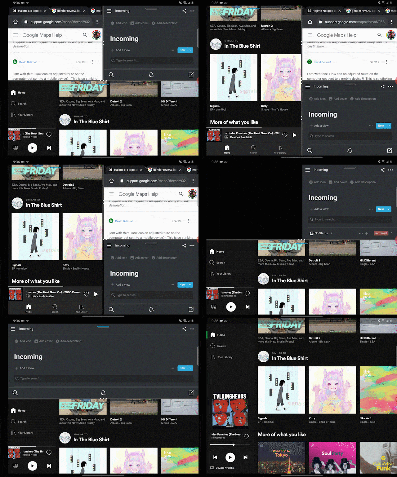
But what if you want to run multiple apps at the same time? A screen as big as this one just begs for clever multitasking tricks, and Samsung added quite a few of them. Multi-active window mode, which lets you squeeze up to three apps into an on-screen grid at a time, is back. (If you really want to go wild, you open up to five more in their own floating windows, but no human should ever need this.) This grid view can be tremendously helpful once you find the right combination of apps, and it’s relatively easy to save them as a preset in case you want to use them again later. You can also shuffle windows around so that one big app stretches along the bottom of the entire screen, with two smaller windows side-by-side above it. 

That improved flexibility is a welcome addition, but it still has its quirks. What if you wanted that big app window to take up the top half of the screen instead? Too bad. And some apps refuse to appear in those smaller app windows at all, which you’ll only ever discover after trial and error. The quirks don’t end there. One of the biggest software additions to the Fold 2 is the ability to copy and paste by dragging text or an image from one window and dropping it into another. It’s fantastic when it works, but — and tell if this sounds familiar — it just doesn’t work sometimes. 

Samsung Galaxy Z Fold 2 review

Engadget

Dragging and dropping between multiple instances of the Office app works like a dream. So does dragging text from Chrome into Samsung’s Messages app. But trying to move a snippet of text from a browser into, say, Google Docs? Nope. Ditto for dragging and dropping into Notion, which I’ve come to rely on pretty heavily. There’s that pesky inconsistency again!

By now, it probably sounds like the Fold 2’s software is sort of a flop, and in some ways it is. But there are clever features that make use of the foldable gimmick. App continuity is a great example: it ensures that whatever you’re doing on that outer screen persists on the internal one when you open the Fold 2. Apart from the occasional compatibility issue, the transitions work well. This year, Samsung spent a little more time touting reverse app continuity, where the apps you’re using on the inside screen shift to the outer screen when the Fold 2 is closed. 

There’s no universal switch for it, though — you have to pop into the settings and select apps to make the inside-to-outside switch. That’s the right decision. I don’t want my PayPal information visible when I slam the Fold 2 shut, I do want to keep reading my Kindle book when I’m standing in line and suddenly need to use my other hand.

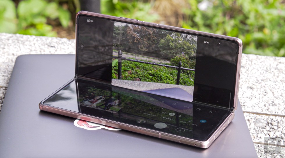
Then there are all those Flex mode features, which Samsung originally built for the Galaxy Z Flip.  Long story short, Samsung and partners like Google tweaked their apps to take advantage of that big display when the Fold 2 is propped open like a laptop. When you fold the phone while shooting photos, for instance, the viewfinder remains on the top half of the screen while the bottom half gives you access to camera settings and controls, along with a quick view of the photos you just took. Making video calls with Duo in Flex mode is a joy, too: The person you’re talking to fills half of the screen, leaving just the hangup button and some other options beneath it.


Brian Oh/Engadget

The number of apps that support Flex mode is limited, but honestly, that’s OK. Not every bit of software can really benefit from it. And I’d rather developers spend their time optimizing apps for foldables in other ways. You know, like making sure they display correctly. 

That’s the thing about foldables right now. It’s tempting to lump all of them into a single bucket, but that doesn’t work. The Razr and the Z Flip are, at their core, regular smartphones that fold in half. Because of that, apps don’t really have to change to suit them. Others like the Huawei Mate X and the Fold 2, are small tablets that collapse into barely pocketable phones, and that’s where things start to get tricky. 

It’s going to take time for app developers to adapt their software for devices like the Fold 2, and I wouldn’t be surprised if most of them decided to take their sweet time since foldables are fringe cases right now anyway. As a result, Samsung might have nailed the Fold 2’s hardware, but the people who buy it will still have to wait until the rest of the world catches up.

Ultimately, it feels like we’re looking at a very specific chicken-and-egg problem. App developers have little incentive to update their work until foldables become more mainstream, but the people who have already adopted these phones may be turned off by unoptimized software. For now, the only real answer is to make a fuss and wait to see when and if the industry responds. Until then, the Fold 2 is always going to feel less than polished.

Chris Velazco/Engadget

Image credit: Chris Velazco/Engadget

In use

Like the new Galaxy Note, the Fold 2 uses Qualcomm’s Snapdragon 865 Plus, which is the most powerful sliver of silicon you’ll find in an Android smartphone right now. (Like it or not, Apple has a significant lead in mobile processor performance.) It’s a good thing Samsung went with this top of the line chip, too — hardly any other smartphones have to worry about running two separate, high-resolution displays. 

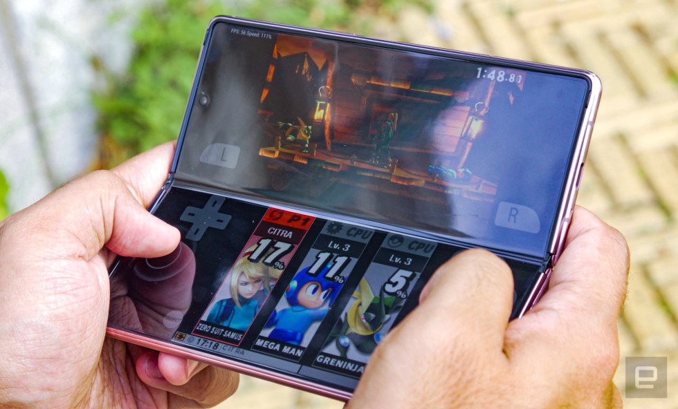
The Fold 2 had more than enough processing power to tackle everything I threw at it, from long stretches of dinosaur-dodging in Ark: Survival Evolved, to 4K video rendering, to long stretches of multi-window app use. It’s even powerful enough to handle console emulation, which tends to throw lesser smartphones for a loop. Consider Citra: It’s a Nintendo 3DS emulator that was ported to Android this year and chokes on anything but the fastest chipsets out there. Not so on the Fold 2. I’m not saying anyone will enjoy playing the 3DS versions of Super Smash Brothers or Monster Hunter 4 Ultimate on a phone, but the fact that you can is still plenty impressive. (In case you’re reading this, Nintendo, I own all the games I played on the Fold 2 and I dumped the ROMs myself. Please don’t sue me.)


Brian Oh/Engadget

That’s not to say everything runs perfectly all the time. Sometimes, when you swipe down to access the notification shade on the outer screen, the whole thing just goes blank. Slightly more concerning is that you’ll sometimes see apps hang and animations pause, particularly when they’re running in multi-window mode. That leads me to my only real gripe, which is that 12GB of RAM doesn’t seem like enough for the kinds of multitasking frenzies the Fold 2 feels built for. Still, these stutters have been infrequent enough that they’re forgivable — here’s hoping they get ironed out in a software update.

Going into this, I was concerned about the kind of toll two screens would have on a 4,500mAh battery, but the reality wasn’t as bad as I had feared. With the internal screen to set to its variable refresh mode, I typically got just under twelve hours of fairly consistent use — that includes lots of camera testing, YouTube videos and games on the big screen, and lots of Twitter scrolling and New York Times articles on the smaller one. Honestly, it wouldn’t have taken much work to squeeze better battery life out of the Fold 2, either. Because I was testing it for the purpose of writing this review, I made it a point to flip the Fold 2 open and use that flexible screen whenever possible — even if I didn’t really need to.

Crafting any smartphone is an exercise in compromise, and for the Z Fold 2, those compromises can be seen in its trio of 12-megapixel rear sensors. At best, they produce solid photos, complete with satisfying colors and decent detail. But at worst, they’re responsible for soft, smeary images that would be disappointing even from a phone that cost half as much. 

Gallery: Samsung Galaxy Z Fold 2 camera sample photos | 29 Photos

You don’t need to worry about the standard wide camera too much — Samsung made sure it was the most well-rounded of the bunch. When you’re shooting in ideal conditions (broad daylight, in other words), you’ll wind up with plenty of attractive examples. Low-light performance is mostly just passable, which is disappointing considering how good the Note 20 Ultra could be at night shooting. A bit of friendly advice: Use this camera whenever possible. Yes, even for selfies — the external screen makes it easy to frame yourself and snap a quick one, and the results are much better than what you’d get from either of the 10-megapixel front-facing cameras.

Really, it’s the telephoto and wide cameras you need to worry about. The former has a 2x optical zoom, which wouldn’t seem so bad if Samsung hadn’t just spent most of a year pushing its other phones’ super-long-range cameras. It doesn’t help that even in bright conditions, the tight shots this produces are lacking in detail. It’s especially bad when things get dark. The same goes for the ultra-wide camera: You probably won’t notice its somewhat hazy details most of the time since, well, it’s an ultra-wide camera. Fine details are kind of naturally less important than an expansive field of view. But at night? It’s awful. Even on relatively well-lit streets, like the stretch of Broadway that runs past our New York office, the lack of clarity is just heinous.


Chris Velazco/Engadget

Wrap-up

If you’re asking yourself if you need this phone, just stop — that’s not the right question. Even now, no one needs a Z Fold 2. That’s not just because it’s crazy-expensive or fragile in ways other phones aren’t, though those are certainly true. Living with the Fold 2 for the last week has made clear just how much work Samsung and Google and the app developers of the world have ahead of them to make foldables as reliable as they need to be. 

Despite all that, the Galaxy Z Fold 2 has tremendous potential, and it doesn’t hurt that Samsung upped its hardware game dramatically. Like I said at the beginning of this review, this is the finest foldable you can buy right now. But the future of devices like these was never just about hardware. Samsung did the hard work of making a great foldable phone — now it, and everyone else, has to get to work and reshape the ecosystem to help devices like the Fold 2 flourish.

Key specs

Samsung Galaxy Z Flip

Processor

Octa-core Snapdragon 865 Plus

RAM / storage

12GB/256GB

MicroSD card support

N/A

Main Display

7.6-inch Dynamic AMOLED 2X Infinity-O, variable refresh rate

Display resolution

2,208 x 1,768 (5:4)

External Display

6.2-inch Dynamic AMOLED

Display resolution

2260 x 816 (25:9)

Rear cameras

12MP f/2.2 ultra-wide-angle camera, 12MP f/1.8 wide-angle camera with Dual Pixel PDAF and OIS, 12MP f/2.4 telephoto camera with 2x optical zoom

Front-facing camera

10MP f/2.2 camera (internal and external)

OS

Android 10 with One UI 2.5

Battery

4,500mAh

Charging

USB-C, supports QuickCharge 2.0 and Samsung Adaptive Fast Charging

Dimensions

159.2 x 68 x 16.8mm (closed), 159.2 x 128.2 x 6.9mm (open)

Weight

282g

Fingerprint sensor

Yes, side-mounted

Waterproofing

N/A

NFC

Yes

Headphone jack

No

5G

Yes, mmWave and sub-6

All products recommended by Engadget are selected by our editorial team, independent of our parent company. Some of our stories include affiliate links. If you buy something through one of these links, we may earn an affiliate commission.

Let’s block ads! (Why?)

728x90x4

Source link

Continue Reading

Tech

Ottawa orders TikTok’s Canadian arm to be dissolved

Published

 on


The federal government is ordering the dissolution of TikTok’s Canadian business after a national security review of the Chinese company behind the social media platform, but stopped short of ordering people to stay off the app.

Industry Minister François-Philippe Champagne announced the government’s “wind up” demand Wednesday, saying it is meant to address “risks” related to ByteDance Ltd.’s establishment of TikTok Technology Canada Inc.

“The decision was based on the information and evidence collected over the course of the review and on the advice of Canada’s security and intelligence community and other government partners,” he said in a statement.

The announcement added that the government is not blocking Canadians’ access to the TikTok application or their ability to create content.

However, it urged people to “adopt good cybersecurity practices and assess the possible risks of using social media platforms and applications, including how their information is likely to be protected, managed, used and shared by foreign actors, as well as to be aware of which country’s laws apply.”

Champagne’s office did not immediately respond to a request for comment seeking details about what evidence led to the government’s dissolution demand, how long ByteDance has to comply and why the app is not being banned.

A TikTok spokesperson said in a statement that the shutdown of its Canadian offices will mean the loss of hundreds of well-paying local jobs.

“We will challenge this order in court,” the spokesperson said.

“The TikTok platform will remain available for creators to find an audience, explore new interests and for businesses to thrive.”

The federal Liberals ordered a national security review of TikTok in September 2023, but it was not public knowledge until The Canadian Press reported in March that it was investigating the company.

At the time, it said the review was based on the expansion of a business, which it said constituted the establishment of a new Canadian entity. It declined to provide any further details about what expansion it was reviewing.

A government database showed a notification of new business from TikTok in June 2023. It said Network Sense Ventures Ltd. in Toronto and Vancouver would engage in “marketing, advertising, and content/creator development activities in relation to the use of the TikTok app in Canada.”

Even before the review, ByteDance and TikTok were lightning rod for privacy and safety concerns because Chinese national security laws compel organizations in the country to assist with intelligence gathering.

Such concerns led the U.S. House of Representatives to pass a bill in March designed to ban TikTok unless its China-based owner sells its stake in the business.

Champagne’s office has maintained Canada’s review was not related to the U.S. bill, which has yet to pass.

Canada’s review was carried out through the Investment Canada Act, which allows the government to investigate any foreign investment with potential to might harm national security.

While cabinet can make investors sell parts of the business or shares, Champagne has said the act doesn’t allow him to disclose details of the review.

Wednesday’s dissolution order was made in accordance with the act.

The federal government banned TikTok from its mobile devices in February 2023 following the launch of an investigation into the company by federal and provincial privacy commissioners.

— With files from Anja Karadeglija in Ottawa

This report by The Canadian Press was first published Nov. 6, 2024.

The Canadian Press. All rights reserved.

Source link

Continue Reading

Health

Here is how to prepare your online accounts for when you die

Published

 on


LONDON (AP) — Most people have accumulated a pile of data — selfies, emails, videos and more — on their social media and digital accounts over their lifetimes. What happens to it when we die?

It’s wise to draft a will spelling out who inherits your physical assets after you’re gone, but don’t forget to take care of your digital estate too. Friends and family might treasure files and posts you’ve left behind, but they could get lost in digital purgatory after you pass away unless you take some simple steps.

Here’s how you can prepare your digital life for your survivors:

Apple

The iPhone maker lets you nominate a “ legacy contact ” who can access your Apple account’s data after you die. The company says it’s a secure way to give trusted people access to photos, files and messages. To set it up you’ll need an Apple device with a fairly recent operating system — iPhones and iPads need iOS or iPadOS 15.2 and MacBooks needs macOS Monterey 12.1.

For iPhones, go to settings, tap Sign-in & Security and then Legacy Contact. You can name one or more people, and they don’t need an Apple ID or device.

You’ll have to share an access key with your contact. It can be a digital version sent electronically, or you can print a copy or save it as a screenshot or PDF.

Take note that there are some types of files you won’t be able to pass on — including digital rights-protected music, movies and passwords stored in Apple’s password manager. Legacy contacts can only access a deceased user’s account for three years before Apple deletes the account.

Google

Google takes a different approach with its Inactive Account Manager, which allows you to share your data with someone if it notices that you’ve stopped using your account.

When setting it up, you need to decide how long Google should wait — from three to 18 months — before considering your account inactive. Once that time is up, Google can notify up to 10 people.

You can write a message informing them you’ve stopped using the account, and, optionally, include a link to download your data. You can choose what types of data they can access — including emails, photos, calendar entries and YouTube videos.

There’s also an option to automatically delete your account after three months of inactivity, so your contacts will have to download any data before that deadline.

Facebook and Instagram

Some social media platforms can preserve accounts for people who have died so that friends and family can honor their memories.

When users of Facebook or Instagram die, parent company Meta says it can memorialize the account if it gets a “valid request” from a friend or family member. Requests can be submitted through an online form.

The social media company strongly recommends Facebook users add a legacy contact to look after their memorial accounts. Legacy contacts can do things like respond to new friend requests and update pinned posts, but they can’t read private messages or remove or alter previous posts. You can only choose one person, who also has to have a Facebook account.

You can also ask Facebook or Instagram to delete a deceased user’s account if you’re a close family member or an executor. You’ll need to send in documents like a death certificate.

TikTok

The video-sharing platform says that if a user has died, people can submit a request to memorialize the account through the settings menu. Go to the Report a Problem section, then Account and profile, then Manage account, where you can report a deceased user.

Once an account has been memorialized, it will be labeled “Remembering.” No one will be able to log into the account, which prevents anyone from editing the profile or using the account to post new content or send messages.

X

It’s not possible to nominate a legacy contact on Elon Musk’s social media site. But family members or an authorized person can submit a request to deactivate a deceased user’s account.

Passwords

Besides the major online services, you’ll probably have dozens if not hundreds of other digital accounts that your survivors might need to access. You could just write all your login credentials down in a notebook and put it somewhere safe. But making a physical copy presents its own vulnerabilities. What if you lose track of it? What if someone finds it?

Instead, consider a password manager that has an emergency access feature. Password managers are digital vaults that you can use to store all your credentials. Some, like Keeper,Bitwarden and NordPass, allow users to nominate one or more trusted contacts who can access their keys in case of an emergency such as a death.

But there are a few catches: Those contacts also need to use the same password manager and you might have to pay for the service.

___

Is there a tech challenge you need help figuring out? Write to us at onetechtip@ap.org with your questions.

Source link

Continue Reading

Tech

Google’s partnership with AI startup Anthropic faces a UK competition investigation

Published

 on


LONDON (AP) — Britain’s competition watchdog said Thursday it’s opening a formal investigation into Google’s partnership with artificial intelligence startup Anthropic.

The Competition and Markets Authority said it has “sufficient information” to launch an initial probe after it sought input earlier this year on whether the deal would stifle competition.

The CMA has until Dec. 19 to decide whether to approve the deal or escalate its investigation.

“Google is committed to building the most open and innovative AI ecosystem in the world,” the company said. “Anthropic is free to use multiple cloud providers and does, and we don’t demand exclusive tech rights.”

San Francisco-based Anthropic was founded in 2021 by siblings Dario and Daniela Amodei, who previously worked at ChatGPT maker OpenAI. The company has focused on increasing the safety and reliability of AI models. Google reportedly agreed last year to make a multibillion-dollar investment in Anthropic, which has a popular chatbot named Claude.

Anthropic said it’s cooperating with the regulator and will provide “the complete picture about Google’s investment and our commercial collaboration.”

“We are an independent company and none of our strategic partnerships or investor relationships diminish the independence of our corporate governance or our freedom to partner with others,” it said in a statement.

The U.K. regulator has been scrutinizing a raft of AI deals as investment money floods into the industry to capitalize on the artificial intelligence boom. Last month it cleared Anthropic’s $4 billion deal with Amazon and it has also signed off on Microsoft’s deals with two other AI startups, Inflection and Mistral.

The Canadian Press. All rights reserved.

Source link

Continue Reading

Trending